Figma Variant Matrix Skill
Define component variants and states systematically for Figma.
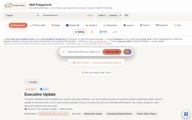
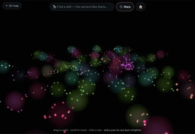

From the mohitagw15856/pm-claude-skills README — shows the whole collection, not only this skill. · view on GitHub
How to use it
Claude Code
- Run the line below. It pulls the whole folder into
~/.claude/skills/figma-variant-matrix. - Describe your job in plain words. Claude Code follows the skill from there.
npx degit mohitagw15856/pm-claude-skills/skills/figma-variant-matrix#main ~/.claude/skills/figma-variant-matrixFor one project only, change the path to .claude/skills/figma-variant-matrix.
Claude (web or desktop app)
- On this page open ⋯ → Download .md.
- Save it as SKILL.md in a folder, zip the folder, then Customize → Skills → + → Create skill → Upload a skill.
- Pick the file and Save. Claude shows the name and description and runs a security scan.
- Check the skill is switched on.
- Start a new chat and describe your job in plain words. The AI follows the skill from there.
ChatGPT or another app
- ChatGPT: make a Project and paste it into Instructions.
- Neither? Paste it at the top of a new chat — it works for that chat.
Not working?
- Check which app you pasted it into — the steps above name the right one.
- Some skills need the paid tier of Claude or ChatGPT.
Paste into Claude, ChatGPT or Cursor.
Source of Figma Variant Matrix Skill
Show the full text86 lines
| name | description |
|---|---|
| figma-variant-matrix | Define component variants and states systematically for Figma. Use when asked to plan component variants, define states for a component, set up a Figma variant matrix, or work out what properties a component needs before building it. Produces a complete variant matrix with all properties, values, and combinations needed. |
Figma Variant Matrix Skill
Defines all variants, properties, and states a component needs before building it in Figma — preventing missing variants discovered after the component is already used across 40 screens.
Required Inputs
- Component name (Button, Card, Input, Badge, Navigation item, etc.)
- Component purpose (what does it do, where is it used?)
- Platform (iOS / Android / Web / Multi-platform)
- Design system context (standalone / part of existing system)
Output Structure
1. Component Overview
Name, category (Interactive/Display/Layout/Form/Navigation/Feedback), used in contexts.
2. Variant Properties
| Property | Values | Notes |
|---|---|---|
| Type | Primary, Secondary, Tertiary, Destructive | |
| Size | Large, Medium, Small | |
| State | Default, Hover, Active, Disabled, Loading | |
| Icon | None, Leading, Trailing, Only |
Total combinations: [N]. Flag if over 50 — consider splitting into multiple components.
3. State Definitions
For each state, list only what changes from Default:
- Default: [Full visual spec]
- Hover (web): [Delta from default]
- Active/Pressed: [Delta]
- Disabled: [Delta — use layer-level properties, not opacity on whole component]
- Loading: [What replaces label, interactive during loading?]
- Error (forms): [Border colour, helper text, icon changes]
4. Anatomy Breakdown
| Layer name | Purpose | Required? | Notes |
|---|---|---|---|
| container | Background and bounds | Yes | |
| label | Text | Conditional | Hide when icon-only |
| icon-leading | Leading icon slot | No |
5. Token Mapping
| Property | Token | Fallback |
|---|---|---|
| Background default | color.brand.primary | #hex |
| Border radius | radius.medium | 8px |
6. Build Order
- Default state, most common variant
- Convert to component, add properties
- Size variants
- State variants
- Type variants
- Icon slot variants last
Quality Checks
- All interactive states defined
- Total variant count calculated, flagged if over 50
- Every layer named semantically
- Token mapping covers all visual properties
- Disabled state uses layer-level properties not opacity
Anti-Patterns
- Do not create a variant matrix with properties that overlap or conflict — each property must be independently variable
- Do not use opacity for disabled states — disabled states must use layer-level properties, not opacity
- Do not enumerate every mathematical combination if many are invalid — document only valid, buildable combinations
- Do not define variants without considering responsive behaviour — specify which properties change across screen sizes
- Do not produce a matrix without Figma implementation guidance — variant naming conventions must follow Figma's property system
Example Trigger Phrases
- "Define the variants for a [component] in Figma"
- "What states does my [component] need?"
- "Help me plan the variant matrix for [component]"
- "Set up the Figma properties for a [button/card/input]"
- "What are all the combinations I need for my [component]?"
| 1 | |
| 2 | name figma-variant-matrix |
| 3 | description "Define component variants and states systematically for Figma. Use when asked to plan component variants, define states for a component, set up a Figma variant matrix, or work out what properties a component needs before building it. Produces a complete variant matrix with all properties, values, and combinations needed." |
| 4 | |
| 5 | |
| 6 | # Figma Variant Matrix Skill |
| 7 | |
| 8 | Defines all variants, properties, and states a component needs before building it in Figma — preventing missing variants discovered after the component is already used across 40 screens. |
| 9 | |
| 10 | ## Required Inputs |
| 11 | |
| 12 | **Component name** (Button, Card, Input, Badge, Navigation item, etc.) |
| 13 | **Component purpose** (what does it do, where is it used?) |
| 14 | **Platform** (iOS / Android / Web / Multi-platform) |
| 15 | **Design system context** (standalone / part of existing system) |
| 16 | |
| 17 | ## Output Structure |
| 18 | |
| 19 | ### 1. Component Overview |
| 20 | Name, category (Interactive/Display/Layout/Form/Navigation/Feedback), used in contexts. |
| 21 | |
| 22 | ### 2. Variant Properties |
| 23 | |
| 24 | | Property | Values | Notes | |
| 25 | |---|---|---| |
| 26 | | Type | Primary, Secondary, Tertiary, Destructive | | |
| 27 | | Size | Large, Medium, Small | | |
| 28 | | State | Default, Hover, Active, Disabled, Loading | | |
| 29 | | Icon | None, Leading, Trailing, Only | | |
| 30 | |
| 31 | Total combinations: [N]. Flag if over 50 — consider splitting into multiple components. |
| 32 | |
| 33 | ### 3. State Definitions |
| 34 | |
| 35 | For each state, list only what changes from Default: |
| 36 | Default: [Full visual spec] |
| 37 | Hover (web): [Delta from default] |
| 38 | Active/Pressed: [Delta] |
| 39 | Disabled: [Delta — use layer-level properties, not opacity on whole component] |
| 40 | Loading: [What replaces label, interactive during loading?] |
| 41 | Error (forms): [Border colour, helper text, icon changes] |
| 42 | |
| 43 | ### 4. Anatomy Breakdown |
| 44 | |
| 45 | | Layer name | Purpose | Required? | Notes | |
| 46 | |---|---|---|---| |
| 47 | | container | Background and bounds | Yes | | |
| 48 | | label | Text | Conditional | Hide when icon-only | |
| 49 | | icon-leading | Leading icon slot | No | | |
| 50 | |
| 51 | ### 5. Token Mapping |
| 52 | |
| 53 | | Property | Token | Fallback | |
| 54 | |---|---|---| |
| 55 | | Background default | color.brand.primary | #hex | |
| 56 | | Border radius | radius.medium | 8px | |
| 57 | |
| 58 | ### 6. Build Order |
| 59 | Default state, most common variant |
| 60 | Convert to component, add properties |
| 61 | Size variants |
| 62 | State variants |
| 63 | Type variants |
| 64 | Icon slot variants last |
| 65 | |
| 66 | ## Quality Checks |
| 67 | [ ] All interactive states defined |
| 68 | [ ] Total variant count calculated, flagged if over 50 |
| 69 | [ ] Every layer named semantically |
| 70 | [ ] Token mapping covers all visual properties |
| 71 | [ ] Disabled state uses layer-level properties not opacity |
| 72 | |
| 73 | ## Anti-Patterns |
| 74 | |
| 75 | [ ] Do not create a variant matrix with properties that overlap or conflict — each property must be independently variable |
| 76 | [ ] Do not use opacity for disabled states — disabled states must use layer-level properties, not opacity |
| 77 | [ ] Do not enumerate every mathematical combination if many are invalid — document only valid, buildable combinations |
| 78 | [ ] Do not define variants without considering responsive behaviour — specify which properties change across screen sizes |
| 79 | [ ] Do not produce a matrix without Figma implementation guidance — variant naming conventions must follow Figma's property system |
| 80 | |
| 81 | ## Example Trigger Phrases |
| 82 | "Define the variants for a [component] in Figma" |
| 83 | "What states does my [component] need?" |
| 84 | "Help me plan the variant matrix for [component]" |
| 85 | "Set up the Figma properties for a [button/card/input]" |
| 86 | "What are all the combinations I need for my [component]?" |
Discussion
Browse more free Claude skills or everything in Design.