Accessibility Audit Skill
Generate a WCAG 2.2 accessibility audit checklist and remediation suggestions for any UI or design.
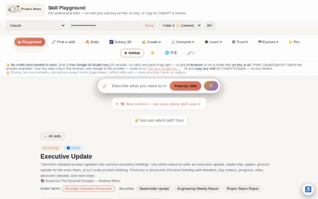
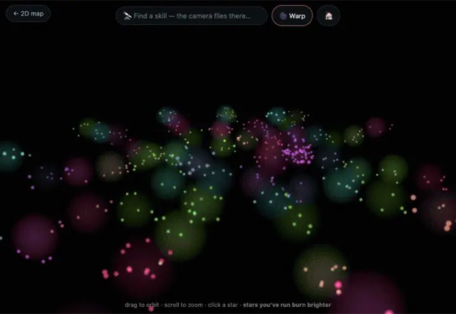
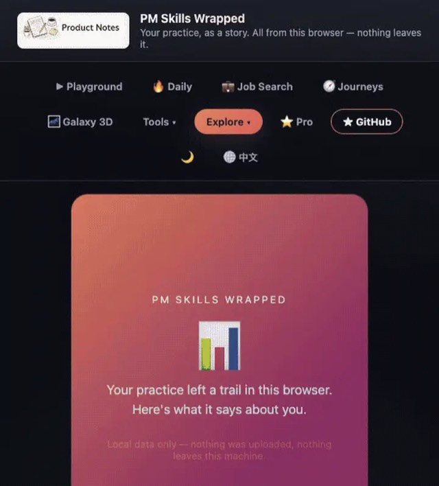
From the mohitagw15856/pm-claude-skills README — shows the whole collection, not only this skill. · view on GitHub
How to use it
Claude Code
- Run the line below. It pulls the whole folder into
~/.claude/skills/accessibility-audit. - Describe your job in plain words. Claude Code follows the skill from there.
npx degit mohitagw15856/pm-claude-skills/skills/accessibility-audit#main ~/.claude/skills/accessibility-auditFor one project only, change the path to .claude/skills/accessibility-audit.
Claude (web or desktop app)
- On this page open ⋯ → Download .md.
- Save it as SKILL.md in a folder, zip the folder, then Customize → Skills → + → Create skill → Upload a skill.
- Pick the file and Save. Claude shows the name and description and runs a security scan.
- Check the skill is switched on.
- Start a new chat and describe your job in plain words. The AI follows the skill from there.
ChatGPT or another app
- ChatGPT: make a Project and paste it into Instructions.
- Neither? Paste it at the top of a new chat — it works for that chat.
Not working?
- Check which app you pasted it into — the steps above name the right one.
- Some skills need the paid tier of Claude or ChatGPT.
Paste into Claude, ChatGPT or Cursor.
Source of Accessibility Audit Skill
Show the full text209 lines
| name | description |
|---|---|
| accessibility-audit | Generate a WCAG 2.2 accessibility audit checklist and remediation suggestions for any UI or design. Use when asked to audit for accessibility, check WCAG compliance, review a design for a11y issues, or create an accessibility remediation plan. Produces a prioritised checklist with pass/fail assessments and specific fixes. |
Accessibility Audit Skill
This skill produces a structured accessibility audit based on WCAG 2.2 guidelines. It covers visual, motor, cognitive, and screen reader accessibility — with prioritised remediation for each issue found.
Required Inputs
Ask the user for these if not provided:
- What is being audited (screen, component, full product, design spec)
- Description or image of the UI
- Target WCAG level (A / AA / AAA — default to AA, which is the legal standard in most jurisdictions)
- Known assistive technology users? (Yes/No — if yes, which: screen reader / switch access / voice control / magnification)
- Platform (Web / iOS / Android / Desktop app)
Programmatic Helper
Contrast ratios cannot be eyeballed. The AA line sits at 4.5:1, and #777777
on white is 4.478 (fails) while #767676 is 4.54 (passes) — no amount of
looking at a screenshot separates those. Compute them:
npx --yes notugly fix "#8ab4f8" "#ffffff"     # ratio, APCA, and the nearest passing colour
npx --yes notugly onepager <url> --out review.html   # every pairing, printable
npx --yes notugly vision                      # which colours merge for colour-blind viewers
notugly fix returns the ratio, the APCA lightness contrast, and the closest
colour to the one already chosen that passes — same hue, same chroma. Paste
those numbers into the tables below rather than estimating them.
Deterministic, zero dependencies, and no model call — so it costs nothing to run and gives the same answer every time.
For 1.4.3 Contrast (Minimum) and 1.4.11 Non-text Contrast, every row in the remediation table should carry a measured ratio, not an assessment. If the user supplied a screenshot rather than hex values, say so explicitly in the audit — an inferred ratio is not an audit finding.
Output Structure
Accessibility Audit: [Component or Screen Name]
Target standard: WCAG 2.2 Level [AA] Platform: [Platform] Date: [Date]
Audit Summary
| Category | Issues Found | Critical | Moderate | Minor |
|---|---|---|---|---|
| Perceivable | ||||
| Operable | ||||
| Understandable | ||||
| Robust | ||||
| Total |
Overall compliance status: ✅ Compliant / 🟡 Minor issues / 🔴 Fails AA standard
Perceivable
1.1 Text Alternatives
- All images have descriptive alt text (not filename or "image")
- Decorative images have
alt=""to be skipped by screen readers - Icons without visible labels have accessible names
- Complex images (charts, diagrams) have extended descriptions
Issues found: [List specific issues or "None"]
1.3 Adaptable
- Content structure uses semantic HTML (headings, lists, landmarks) — not just visual formatting
- Reading order in DOM matches visual order
- Form inputs have associated labels (not placeholder text as label)
- Data tables have proper headers and scope
Issues found:
1.4 Distinguishable
- Text contrast ratio ≥ 4.5:1 (normal text) or ≥ 3:1 (large text 18px+)
- UI component contrast ratio ≥ 3:1 against background
- Information is not conveyed by colour alone
- Text can be resized to 200% without loss of content
- No content that auto-plays audio
Issues found:
Operable
2.1 Keyboard Accessible
- All interactive elements are reachable by keyboard (Tab key)
- No keyboard traps
- Custom components have keyboard interactions (arrow keys for menus, Escape to close modals)
- Skip navigation link available for pages with repeated navigation
Issues found:
2.4 Navigable
- Focus is visible at all times (not removed with
outline: nonewithout replacement) - Focus order is logical and predictable
- Page/screen has a descriptive title
- Link text is descriptive (not "click here" or "read more")
- Headings are hierarchical (H1 → H2 → H3, no skips)
Issues found:
2.5 Input Modalities
- Touch targets are at least 44x44px
- No functionality requires complex gestures (pinch, multi-touch) without a simple alternative
- Motion or dragging interactions have button alternatives
Issues found:
Understandable
3.1 Readable
- Language of the page is set (
langattribute) - Unusual words, abbreviations, or jargon are explained
3.2 Predictable
- Navigation is consistent across screens
- Components behave consistently (same button does the same thing)
- No unexpected context changes on focus or input
3.3 Input Assistance
- Error messages identify the field and describe the error in plain language (not just "Invalid input")
- Required fields are labelled (not just with colour or asterisk alone)
- Forms provide suggestions for correcting errors where possible
Issues found:
Robust
4.1 Compatible
- HTML is valid and well-structured
- ARIA roles and attributes are used correctly (not to fix broken semantics)
- Status messages (success, error, loading) are announced to screen readers without focus change
Issues found:
Prioritised Remediation List
| Priority | Issue | WCAG Criterion | Fix | Effort |
|---|---|---|---|---|
| 🔴 Critical | [Issue] | [e.g. 1.4.3 Contrast] | [Specific fix] | [Low/Med/High] |
| 🟡 Moderate | [Issue] | |||
| 🟢 Minor | [Issue] |
Priority definitions:
- 🔴 Critical: Blocks access for users with disabilities. Legal risk. Fix before launch.
- 🟡 Moderate: Significant friction. Fix in next sprint.
- 🟢 Minor: Best practice. Address in roadmap.
Quick Wins (Fix in < 1 hour)
[List any issues that are trivially fixable — e.g. adding alt text, fixing contrast with a colour swap, adding a lang attribute. These are easy to ship immediately.]
Testing Recommendations
- Manual keyboard test: Tab through the entire flow. Can you complete every task without a mouse?
- Screen reader test: VoiceOver (Mac/iOS), NVDA or JAWS (Windows). Is every piece of content and every action accessible?
- Colour contrast check: Use Stark (Figma plugin) or WebAIM Contrast Checker
- Automated scan: Axe DevTools or Lighthouse accessibility audit (catches ~30% of issues automatically)
Quality Checks
- Issues are mapped to specific WCAG criteria
- Every critical issue has a specific fix recommendation
- Quick wins are separated from larger fixes
- Effort estimates are included for prioritisation
- Testing recommendations are included
Anti-Patterns
- Do not rely solely on automated scanning tools — automated checks catch ~30% of issues; manual keyboard and screen reader testing is required
- Do not label an issue "minor" simply because it only affects a small percentage of users — for those users it may block all access
- Do not add ARIA roles to fix broken semantics — use correct semantic HTML first; ARIA is a last resort
- Do not confuse colour contrast of text with colour contrast of UI components — they have different minimum ratios (4.5:1 vs 3:1)
- Do not audit only the happy path — error states, empty states, and loading states must also meet accessibility requirements
Example Trigger Phrases
- "Audit this design for accessibility"
- "Check WCAG compliance for [screen/component]"
- "Give me an a11y audit of [UI description]"
- "What accessibility issues does this design have?"
| 1 | |
| 2 | name accessibility-audit |
| 3 | description "Generate a WCAG 2.2 accessibility audit checklist and remediation suggestions for any UI or design. Use when asked to audit for accessibility, check WCAG compliance, review a design for a11y issues, or create an accessibility remediation plan. Produces a prioritised checklist with pass/fail assessments and specific fixes." |
| 4 | |
| 5 | |
| 6 | # Accessibility Audit Skill |
| 7 | |
| 8 | This skill produces a structured accessibility audit based on WCAG 2.2 guidelines. It covers visual, motor, cognitive, and screen reader accessibility — with prioritised remediation for each issue found. |
| 9 | |
| 10 | ## Required Inputs |
| 11 | |
| 12 | Ask the user for these if not provided: |
| 13 | **What is being audited** (screen, component, full product, design spec) |
| 14 | **Description or image** of the UI |
| 15 | **Target WCAG level** (A / AA / AAA — default to AA, which is the legal standard in most jurisdictions) |
| 16 | **Known assistive technology users?** (Yes/No — if yes, which: screen reader / switch access / voice control / magnification) |
| 17 | **Platform** (Web / iOS / Android / Desktop app) |
| 18 | |
| 19 | |
| 20 | ## Programmatic Helper |
| 21 | |
| 22 | Contrast ratios cannot be eyeballed. The AA line sits at 4.5:1, and `#777777` |
| 23 | on white is 4.478 (fails) while `#767676` is 4.54 (passes) — no amount of |
| 24 | looking at a screenshot separates those. Compute them: |
| 25 | |
| 26 | |
| 27 | npx --yes notugly fix "#8ab4f8" "#ffffff" # ratio, APCA, and the nearest passing colour |
| 28 | npx --yes notugly onepager <url> --out review.html # every pairing, printable |
| 29 | npx --yes notugly vision # which colours merge for colour-blind viewers |
| 30 | |
| 31 | |
| 32 | `notugly fix` returns the ratio, the APCA lightness contrast, and the closest |
| 33 | colour to the one already chosen that passes — same hue, same chroma. Paste |
| 34 | those numbers into the tables below rather than estimating them. |
| 35 | |
| 36 | Deterministic, zero dependencies, and **no model call** — so it costs nothing to |
| 37 | run and gives the same answer every time. |
| 38 | |
| 39 | **For 1.4.3 Contrast (Minimum) and 1.4.11 Non-text Contrast**, every row in the |
| 40 | remediation table should carry a measured ratio, not an assessment. If the user |
| 41 | supplied a screenshot rather than hex values, say so explicitly in the audit — |
| 42 | an inferred ratio is not an audit finding. |
| 43 | |
| 44 | ## Output Structure |
| 45 | |
| 46 | |
| 47 | |
| 48 | # Accessibility Audit: [Component or Screen Name] |
| 49 | **Target standard:** WCAG 2.2 Level [AA] |
| 50 | **Platform:** [Platform] |
| 51 | **Date:** [Date] |
| 52 | |
| 53 | |
| 54 | |
| 55 | ## Audit Summary |
| 56 | |
| 57 | | Category | Issues Found | Critical | Moderate | Minor | |
| 58 | |---|---|---|---|---| |
| 59 | | Perceivable | | | | | |
| 60 | | Operable | | | | | |
| 61 | | Understandable | | | | | |
| 62 | | Robust | | | | | |
| 63 | | **Total** | | | | | |
| 64 | |
| 65 | **Overall compliance status:** ✅ Compliant / 🟡 Minor issues / 🔴 Fails AA standard |
| 66 | |
| 67 | |
| 68 | |
| 69 | ## Perceivable |
| 70 | |
| 71 | ### 1.1 Text Alternatives |
| 72 | [ ] All images have descriptive alt text (not filename or "image") |
| 73 | [ ] Decorative images have `alt=""` to be skipped by screen readers |
| 74 | [ ] Icons without visible labels have accessible names |
| 75 | [ ] Complex images (charts, diagrams) have extended descriptions |
| 76 | |
| 77 | **Issues found:** [List specific issues or "None"] |
| 78 | |
| 79 | ### 1.3 Adaptable |
| 80 | [ ] Content structure uses semantic HTML (headings, lists, landmarks) — not just visual formatting |
| 81 | [ ] Reading order in DOM matches visual order |
| 82 | [ ] Form inputs have associated labels (not placeholder text as label) |
| 83 | [ ] Data tables have proper headers and scope |
| 84 | |
| 85 | **Issues found:** |
| 86 | |
| 87 | ### 1.4 Distinguishable |
| 88 | [ ] Text contrast ratio ≥ 4.5:1 (normal text) or ≥ 3:1 (large text 18px+) |
| 89 | [ ] UI component contrast ratio ≥ 3:1 against background |
| 90 | [ ] Information is not conveyed by colour alone |
| 91 | [ ] Text can be resized to 200% without loss of content |
| 92 | [ ] No content that auto-plays audio |
| 93 | |
| 94 | **Issues found:** |
| 95 | |
| 96 | |
| 97 | |
| 98 | ## Operable |
| 99 | |
| 100 | ### 2.1 Keyboard Accessible |
| 101 | [ ] All interactive elements are reachable by keyboard (Tab key) |
| 102 | [ ] No keyboard traps |
| 103 | [ ] Custom components have keyboard interactions (arrow keys for menus, Escape to close modals) |
| 104 | [ ] Skip navigation link available for pages with repeated navigation |
| 105 | |
| 106 | **Issues found:** |
| 107 | |
| 108 | ### 2.4 Navigable |
| 109 | [ ] Focus is visible at all times (not removed with `outline: none` without replacement) |
| 110 | [ ] Focus order is logical and predictable |
| 111 | [ ] Page/screen has a descriptive title |
| 112 | [ ] Link text is descriptive (not "click here" or "read more") |
| 113 | [ ] Headings are hierarchical (H1 → H2 → H3, no skips) |
| 114 | |
| 115 | **Issues found:** |
| 116 | |
| 117 | ### 2.5 Input Modalities |
| 118 | [ ] Touch targets are at least 44x44px |
| 119 | [ ] No functionality requires complex gestures (pinch, multi-touch) without a simple alternative |
| 120 | [ ] Motion or dragging interactions have button alternatives |
| 121 | |
| 122 | **Issues found:** |
| 123 | |
| 124 | |
| 125 | |
| 126 | ## Understandable |
| 127 | |
| 128 | ### 3.1 Readable |
| 129 | [ ] Language of the page is set (`lang` attribute) |
| 130 | [ ] Unusual words, abbreviations, or jargon are explained |
| 131 | |
| 132 | ### 3.2 Predictable |
| 133 | [ ] Navigation is consistent across screens |
| 134 | [ ] Components behave consistently (same button does the same thing) |
| 135 | [ ] No unexpected context changes on focus or input |
| 136 | |
| 137 | ### 3.3 Input Assistance |
| 138 | [ ] Error messages identify the field and describe the error in plain language (not just "Invalid input") |
| 139 | [ ] Required fields are labelled (not just with colour or asterisk alone) |
| 140 | [ ] Forms provide suggestions for correcting errors where possible |
| 141 | |
| 142 | **Issues found:** |
| 143 | |
| 144 | |
| 145 | |
| 146 | ## Robust |
| 147 | |
| 148 | ### 4.1 Compatible |
| 149 | [ ] HTML is valid and well-structured |
| 150 | [ ] ARIA roles and attributes are used correctly (not to fix broken semantics) |
| 151 | [ ] Status messages (success, error, loading) are announced to screen readers without focus change |
| 152 | |
| 153 | **Issues found:** |
| 154 | |
| 155 | |
| 156 | |
| 157 | ## Prioritised Remediation List |
| 158 | |
| 159 | | Priority | Issue | WCAG Criterion | Fix | Effort | |
| 160 | |---|---|---|---|---| |
| 161 | | 🔴 Critical | [Issue] | [e.g. 1.4.3 Contrast] | [Specific fix] | [Low/Med/High] | |
| 162 | | 🟡 Moderate | [Issue] | | | | |
| 163 | | 🟢 Minor | [Issue] | | | | |
| 164 | |
| 165 | **Priority definitions:** |
| 166 | 🔴 Critical: Blocks access for users with disabilities. Legal risk. Fix before launch. |
| 167 | 🟡 Moderate: Significant friction. Fix in next sprint. |
| 168 | 🟢 Minor: Best practice. Address in roadmap. |
| 169 | |
| 170 | |
| 171 | |
| 172 | ## Quick Wins (Fix in < 1 hour) |
| 173 | |
| 174 | [List any issues that are trivially fixable — e.g. adding alt text, fixing contrast with a colour swap, adding a `lang` attribute. These are easy to ship immediately.] |
| 175 | |
| 176 | |
| 177 | |
| 178 | ## Testing Recommendations |
| 179 | |
| 180 | **Manual keyboard test:** Tab through the entire flow. Can you complete every task without a mouse? |
| 181 | **Screen reader test:** VoiceOver (Mac/iOS), NVDA or JAWS (Windows). Is every piece of content and every action accessible? |
| 182 | **Colour contrast check:** Use Stark (Figma plugin) or WebAIM Contrast Checker |
| 183 | **Automated scan:** Axe DevTools or Lighthouse accessibility audit (catches ~30% of issues automatically) |
| 184 | |
| 185 | |
| 186 | |
| 187 | ## Quality Checks |
| 188 | |
| 189 | [ ] Issues are mapped to specific WCAG criteria |
| 190 | [ ] Every critical issue has a specific fix recommendation |
| 191 | [ ] Quick wins are separated from larger fixes |
| 192 | [ ] Effort estimates are included for prioritisation |
| 193 | [ ] Testing recommendations are included |
| 194 | |
| 195 | ## Anti-Patterns |
| 196 | |
| 197 | [ ] Do not rely solely on automated scanning tools — automated checks catch ~30% of issues; manual keyboard and screen reader testing is required |
| 198 | [ ] Do not label an issue "minor" simply because it only affects a small percentage of users — for those users it may block all access |
| 199 | [ ] Do not add ARIA roles to fix broken semantics — use correct semantic HTML first; ARIA is a last resort |
| 200 | [ ] Do not confuse colour contrast of text with colour contrast of UI components — they have different minimum ratios (4.5:1 vs 3:1) |
| 201 | [ ] Do not audit only the happy path — error states, empty states, and loading states must also meet accessibility requirements |
| 202 | |
| 203 | ## Example Trigger Phrases |
| 204 | |
| 205 | "Audit this design for accessibility" |
| 206 | "Check WCAG compliance for [screen/component]" |
| 207 | "Give me an a11y audit of [UI description]" |
| 208 | "What accessibility issues does this design have?" |
| 209 |
Discussion
Browse more free Claude skills or everything in Design.