Figma Spacing System Skill
Design a spacing and layout token system for a Figma design system.
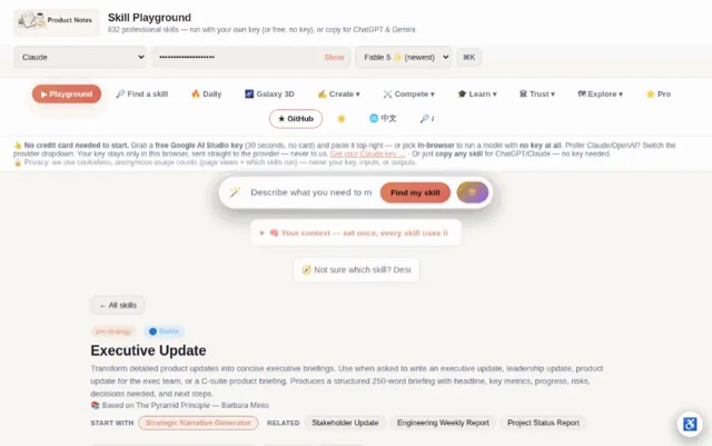

From the mohitagw15856/pm-claude-skills README — shows the whole collection, not only this skill. · view on GitHub
How to use it
Claude Code
- Run the line below. It pulls the whole folder into
~/.claude/skills/figma-spacing-system, including the files SKILL.md points to. - Describe your job in plain words. Claude Code follows the skill from there.
npx degit mohitagw15856/pm-claude-skills/skills/figma-spacing-system#main ~/.claude/skills/figma-spacing-systemFor one project only, change the path to .claude/skills/figma-spacing-system. This skill also uses spacing.md — copying SKILL.md alone won't be enough. See the folder on GitHub.
Claude (web or desktop app)
- On this page open ⋯ → Download .md.
- Save it as SKILL.md in a folder, zip the folder, then Customize → Skills → + → Create skill → Upload a skill.
- Pick the file and Save. Claude shows the name and description and runs a security scan.
- Check the skill is switched on.
- Start a new chat and describe your job in plain words. The AI follows the skill from there.
ChatGPT or another app
- ChatGPT: make a Project and paste it into Instructions.
- Neither? Paste it at the top of a new chat — it works for that chat.
Not working?
- Check which app you pasted it into — the steps above name the right one.
- Some skills need the paid tier of Claude or ChatGPT.
Paste into Claude, ChatGPT or Cursor.
Source of Figma Spacing System Skill
Show the full text85 lines
| name | description |
|---|---|
| figma-spacing-system | Design a spacing and layout token system for a Figma design system. Use when asked to create a spacing system, define layout tokens, set up a grid system, build a spacing scale, or establish layout foundations for a Figma file. Produces a complete spacing scale, grid definition, component spacing conventions, and Figma implementation guide. |
Figma Spacing System Skill
Produces a complete spacing and layout token system — the foundation that makes a design system consistent and developer handoff unambiguous.
Required Inputs
- Platform (iOS / Android / Web / Multi-platform)
- Base unit (4px / 8px — default to 8px)
- Design system name (for token naming)
- Component density (compact / standard / comfortable)
- Grid requirements (or "derive from platform standard")
Output Structure
1. Base Unit
[4px or 8px] with rationale. All values must be multiples.
2. Spacing Scale
| Token | Value | Use case |
|---|---|---|
| spacing.none | 0px | Removing space intentionally |
| spacing.xs | 4/8px | Icon padding, tight labels |
| spacing.sm | 8/12px | Internal component padding compact |
| spacing.md | 12/16px | Internal component padding standard |
| spacing.lg | 16/24px | Section padding, card internal |
| spacing.xl | 24/32px | Between components |
| spacing.2xl | 32/48px | Section separation |
| spacing.3xl | 48/64px | Page-level breaks |
| spacing.4xl | 64/96px | Hero sections |
3. Layout Grid
Mobile (375px): 4 columns, margin [value], gutter [value] Tablet (768px): 8 columns, margin [value], gutter [value] Desktop (1440px): 12 columns, margin [value], gutter [value], max content width [value]
4. Component Spacing Conventions
| Context | Token | Example |
|---|---|---|
| Button horizontal padding | spacing.md | Left/right |
| Button vertical padding | spacing.sm | Top/bottom |
| Card internal padding | spacing.lg | All sides |
| Input padding | spacing.sm vertical, spacing.md horizontal | |
| Icon gap from label | spacing.xs | |
| Section gap | spacing.xl |
5. Figma Implementation
- Create SPACING page documenting each token visually
- Resources > Variables > create Number collection named Spacing
- Apply variables to Auto Layout padding/gap values
- Share token names with engineers as-is or via Tokens Studio
6. Anti-Patterns to Avoid
- Values not on the scale (13px, 22px) — round to nearest token
- Absolute pixel values in components instead of tokens
- Mixing 4px and 8px base units in the same product
Quality Checks
- All token values are multiples of the base unit
- Scale covers xs through 4xl
- Grid defined for all relevant breakpoints
- Component conventions cover common decisions
- Figma implementation steps included
Anti-Patterns
- Do not create a spacing scale with arbitrary values — the scale must follow a consistent mathematical ratio (e.g. 4px base, 8-4-2 system)
- Do not define spacing tokens without Figma implementation instructions — token names alone are not actionable
- Do not create a spacing system that doesn't account for component-level spacing conventions — global tokens and component usage must both be documented
- Do not skip grid definitions — spacing without a grid system is incomplete layout foundation documentation
- Do not produce a spacing system that ignores responsive behaviour — define how spacing adapts across breakpoints
Example Trigger Phrases
- "Create a spacing system for our Figma design system"
- "Define our spacing tokens for Figma"
- "Set up a grid and spacing scale for [product]"
- "What spacing values should we use in our design system?"
- "Help me build the layout foundation for our Figma file"
| 1 | |
| 2 | name figma-spacing-system |
| 3 | description "Design a spacing and layout token system for a Figma design system. Use when asked to create a spacing system, define layout tokens, set up a grid system, build a spacing scale, or establish layout foundations for a Figma file. Produces a complete spacing scale, grid definition, component spacing conventions, and Figma implementation guide." |
| 4 | |
| 5 | |
| 6 | # Figma Spacing System Skill |
| 7 | |
| 8 | Produces a complete spacing and layout token system — the foundation that makes a design system consistent and developer handoff unambiguous. |
| 9 | |
| 10 | ## Required Inputs |
| 11 | |
| 12 | **Platform** (iOS / Android / Web / Multi-platform) |
| 13 | **Base unit** (4px / 8px — default to 8px) |
| 14 | **Design system name** (for token naming) |
| 15 | **Component density** (compact / standard / comfortable) |
| 16 | **Grid requirements** (or "derive from platform standard") |
| 17 | |
| 18 | ## Output Structure |
| 19 | |
| 20 | ### 1. Base Unit |
| 21 | [4px or 8px] with rationale. All values must be multiples. |
| 22 | |
| 23 | ### 2. Spacing Scale |
| 24 | |
| 25 | | Token | Value | Use case | |
| 26 | |---|---|---| |
| 27 | | spacing.none | 0px | Removing space intentionally | |
| 28 | | spacing.xs | 4/8px | Icon padding, tight labels | |
| 29 | | spacing.sm | 8/12px | Internal component padding compact | |
| 30 | | spacing.md | 12/16px | Internal component padding standard | |
| 31 | | spacing.lg | 16/24px | Section padding, card internal | |
| 32 | | spacing.xl | 24/32px | Between components | |
| 33 | | spacing.2xl | 32/48px | Section separation | |
| 34 | | spacing.3xl | 48/64px | Page-level breaks | |
| 35 | | spacing.4xl | 64/96px | Hero sections | |
| 36 | |
| 37 | ### 3. Layout Grid |
| 38 | |
| 39 | Mobile (375px): 4 columns, margin [value], gutter [value] |
| 40 | Tablet (768px): 8 columns, margin [value], gutter [value] |
| 41 | Desktop (1440px): 12 columns, margin [value], gutter [value], max content width [value] |
| 42 | |
| 43 | ### 4. Component Spacing Conventions |
| 44 | |
| 45 | | Context | Token | Example | |
| 46 | |---|---|---| |
| 47 | | Button horizontal padding | spacing.md | Left/right | |
| 48 | | Button vertical padding | spacing.sm | Top/bottom | |
| 49 | | Card internal padding | spacing.lg | All sides | |
| 50 | | Input padding | spacing.sm vertical, spacing.md horizontal | | |
| 51 | | Icon gap from label | spacing.xs | | |
| 52 | | Section gap | spacing.xl | | |
| 53 | |
| 54 | ### 5. Figma Implementation |
| 55 | Create SPACING page documenting each token visually |
| 56 | Resources > Variables > create Number collection named Spacing |
| 57 | Apply variables to Auto Layout padding/gap values |
| 58 | Share token names with engineers as-is or via Tokens Studio |
| 59 | |
| 60 | ### 6. Anti-Patterns to Avoid |
| 61 | Values not on the scale (13px, 22px) — round to nearest token |
| 62 | Absolute pixel values in components instead of tokens |
| 63 | Mixing 4px and 8px base units in the same product |
| 64 | |
| 65 | ## Quality Checks |
| 66 | [ ] All token values are multiples of the base unit |
| 67 | [ ] Scale covers xs through 4xl |
| 68 | [ ] Grid defined for all relevant breakpoints |
| 69 | [ ] Component conventions cover common decisions |
| 70 | [ ] Figma implementation steps included |
| 71 | |
| 72 | ## Anti-Patterns |
| 73 | |
| 74 | [ ] Do not create a spacing scale with arbitrary values — the scale must follow a consistent mathematical ratio (e.g. 4px base, 8-4-2 system) |
| 75 | [ ] Do not define spacing tokens without Figma implementation instructions — token names alone are not actionable |
| 76 | [ ] Do not create a spacing system that doesn't account for component-level spacing conventions — global tokens and component usage must both be documented |
| 77 | [ ] Do not skip grid definitions — spacing without a grid system is incomplete layout foundation documentation |
| 78 | [ ] Do not produce a spacing system that ignores responsive behaviour — define how spacing adapts across breakpoints |
| 79 | |
| 80 | ## Example Trigger Phrases |
| 81 | "Create a spacing system for our Figma design system" |
| 82 | "Define our spacing tokens for Figma" |
| 83 | "Set up a grid and spacing scale for [product]" |
| 84 | "What spacing values should we use in our design system?" |
| 85 | "Help me build the layout foundation for our Figma file" |
Discussion
Browse more free Claude skills or everything in Design.