Figma Design QA Skill
Runs a pre-handoff QA checklist on a Figma design before it goes to engineering.
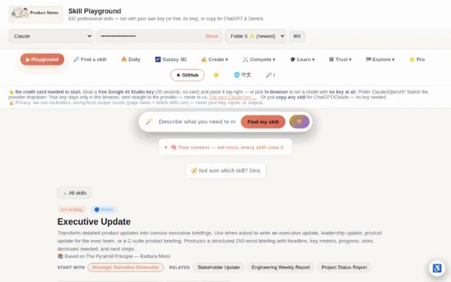
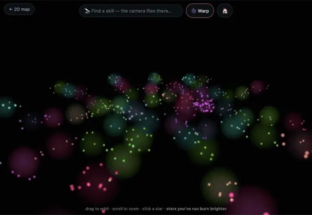
From the mohitagw15856/pm-claude-skills README — shows the whole collection, not only this skill. · view on GitHub
How to use it
Claude Code
- Run the line below. It pulls the whole folder into
~/.claude/skills/figma-design-qa. - Describe your job in plain words. Claude Code follows the skill from there.
npx degit mohitagw15856/pm-claude-skills/skills/figma-design-qa#main ~/.claude/skills/figma-design-qaFor one project only, change the path to .claude/skills/figma-design-qa.
Claude (web or desktop app)
- On this page open ⋯ → Download .md.
- Save it as SKILL.md in a folder, zip the folder, then Customize → Skills → + → Create skill → Upload a skill.
- Pick the file and Save. Claude shows the name and description and runs a security scan.
- Check the skill is switched on.
- Start a new chat and describe your job in plain words. The AI follows the skill from there.
ChatGPT or another app
- ChatGPT: make a Project and paste it into Instructions.
- Neither? Paste it at the top of a new chat — it works for that chat.
Not working?
- Check which app you pasted it into — the steps above name the right one.
- Some skills need the paid tier of Claude or ChatGPT.
Paste into Claude, ChatGPT or Cursor.
Source of Figma Design QA Skill
Show the full text121 lines
| name | description |
|---|---|
| figma-design-qa | Runs a pre-handoff QA checklist on a Figma design before it goes to engineering. Use when asked to QA a Figma design, do a pre-handoff check, or validate a Figma file is ready to build. Produces a structured QA report covering file hygiene, component usage, accessibility, and handoff readiness with explicit pass/fail status per item. Optimised for Opus 4.7 and newer models. |
Figma Design QA Skill
Runs a systematic pre-handoff QA check on a Figma design — catching issues that cause engineering back-and-forth before they become expensive.
Required Inputs
Ask the user for these if not provided:
- Feature or screen being QA-d (describe what has been designed)
- Platform (iOS / Android / Web)
- Design system (custom / Material / HIG / None)
- Handoff tool (Figma Inspect / Zeplin / Storybook / Direct link)
- QA depth (quick 15 min / standard 30 min / thorough 60 min)
Programmatic Helper
Contrast ratios cannot be eyeballed. The AA line sits at 4.5:1, and #777777
on white is 4.478 (fails) while #767676 is 4.54 (passes) — no amount of
looking at a screenshot separates those. Compute them:
npx --yes notugly fix "#8ab4f8" "#ffffff"     # ratio, APCA, and the nearest passing colour
npx --yes notugly onepager <url> --out review.html   # every pairing, printable
npx --yes notugly vision                      # which colours merge for colour-blind viewers
notugly fix returns the ratio, the APCA lightness contrast, and the closest
colour to the one already chosen that passes — same hue, same chroma. Paste
those numbers into the tables below rather than estimating them.
Deterministic, zero dependencies, and no model call — so it costs nothing to run and gives the same answer every time.
QA is a pass/fail activity, so every contrast row needs a number and a verdict.
For a deployed build, npx notugly check <url> exits non-zero on a failure,
which makes it usable directly in CI rather than only by hand.
Output Structure
QA Report: [Feature] | [Date] | [Platform] Overall status: Ready / Minor fixes needed / Not ready
Section 1: File Hygiene
- All layers named semantically (no "Rectangle 12")
- No unused/hidden layers in final frames
- Components from library (not detached copies)
- All text uses text styles (not manual font settings)
- All colours use styles or variables (not hex overrides)
- Frames named to match screen map
- No leftover prototype wires to wrong frames
Section 2: Component Usage
- All buttons use library component
- All inputs use library component
- All icons from approved icon library
- No custom components that should be in library
- Variants used correctly (right size, state, type)
Section 3: Content and Copy
- No placeholder text (Lorem ipsum) in final designs
- All copy reviewed and approved
- Realistic content used (not "User Name")
- Long text edge cases tested
- Error messages are human-readable
- Empty states have copy and CTA
Section 4: States and Coverage
- Default, Loading, Empty, Error, Success states
- Interactive elements have hover/active (web)
- Disabled states designed where applicable
Section 5: Accessibility
- All text meets WCAG AA contrast (4.5:1 body, 3:1 large)
- UI components meet 3:1 contrast against background
- Touch targets minimum 44x44pt iOS / 48x48dp Android
- Focus states for keyboard/switch navigation (web)
- Information not conveyed by colour alone
- Icons have text labels or accessible names annotated
Section 6: Handoff Readiness
- Dev annotations on non-obvious interactions
- Spacing uses Auto Layout (not absolute positioning)
- Images/assets exported at correct resolutions
- Design matches approved requirements
- Link to prototype included
Issues Found
For each fail: [Issue] — Blocking / Fix before handoff / Fix in next iteration
- What: [Specific layer/screen/element]
- Fix: [Exact action needed]
- Owner: [Designer/PM/Both]
Handoff Decision
Status, signed off by, date.
Quality Checks
- All 6 sections completed
- Every fail has a specific description and fix action
- Blocking issues separated from minor ones
- Handoff decision is explicit
Anti-Patterns
- Do not produce a partial QA — every checklist category must be evaluated, not just the ones that are obviously problematic
- Do not leave the handoff decision ambiguous — the output must explicitly state pass, pass with conditions, or fail
- Do not skip accessibility checks — colour contrast, tap target size, and screen reader labels are required, not optional
- Do not report issues without specifying which screen or component they appear on
- Do not approve a design if any component is detached from the library without a documented reason
Example Trigger Phrases
- "QA this Figma design before handoff"
- "Run a pre-handoff check on [feature] design"
- "Is this Figma design ready for engineering?"
- "Do a design QA on [screen/feature]"
- "What needs fixing before we hand this off?"
| 1 | |
| 2 | name figma-design-qa |
| 3 | description "Runs a pre-handoff QA checklist on a Figma design before it goes to engineering. Use when asked to QA a Figma design, do a pre-handoff check, or validate a Figma file is ready to build. Produces a structured QA report covering file hygiene, component usage, accessibility, and handoff readiness with explicit pass/fail status per item. Optimised for Opus 4.7 and newer models." |
| 4 | |
| 5 | |
| 6 | # Figma Design QA Skill |
| 7 | |
| 8 | Runs a systematic pre-handoff QA check on a Figma design — catching issues that cause engineering back-and-forth before they become expensive. |
| 9 | |
| 10 | ## Required Inputs |
| 11 | |
| 12 | Ask the user for these if not provided: |
| 13 | **Feature or screen being QA-d** (describe what has been designed) |
| 14 | **Platform** (iOS / Android / Web) |
| 15 | **Design system** (custom / Material / HIG / None) |
| 16 | **Handoff tool** (Figma Inspect / Zeplin / Storybook / Direct link) |
| 17 | **QA depth** (quick 15 min / standard 30 min / thorough 60 min) |
| 18 | |
| 19 | |
| 20 | ## Programmatic Helper |
| 21 | |
| 22 | Contrast ratios cannot be eyeballed. The AA line sits at 4.5:1, and `#777777` |
| 23 | on white is 4.478 (fails) while `#767676` is 4.54 (passes) — no amount of |
| 24 | looking at a screenshot separates those. Compute them: |
| 25 | |
| 26 | |
| 27 | npx --yes notugly fix "#8ab4f8" "#ffffff" # ratio, APCA, and the nearest passing colour |
| 28 | npx --yes notugly onepager <url> --out review.html # every pairing, printable |
| 29 | npx --yes notugly vision # which colours merge for colour-blind viewers |
| 30 | |
| 31 | |
| 32 | `notugly fix` returns the ratio, the APCA lightness contrast, and the closest |
| 33 | colour to the one already chosen that passes — same hue, same chroma. Paste |
| 34 | those numbers into the tables below rather than estimating them. |
| 35 | |
| 36 | Deterministic, zero dependencies, and **no model call** — so it costs nothing to |
| 37 | run and gives the same answer every time. |
| 38 | |
| 39 | QA is a pass/fail activity, so every contrast row needs a number and a verdict. |
| 40 | For a deployed build, `npx notugly check <url>` **exits non-zero** on a failure, |
| 41 | which makes it usable directly in CI rather than only by hand. |
| 42 | |
| 43 | ## Output Structure |
| 44 | |
| 45 | QA Report: [Feature] | [Date] | [Platform] |
| 46 | **Overall status:** Ready / Minor fixes needed / Not ready |
| 47 | |
| 48 | ### Section 1: File Hygiene |
| 49 | All layers named semantically (no "Rectangle 12") |
| 50 | No unused/hidden layers in final frames |
| 51 | Components from library (not detached copies) |
| 52 | All text uses text styles (not manual font settings) |
| 53 | All colours use styles or variables (not hex overrides) |
| 54 | Frames named to match screen map |
| 55 | No leftover prototype wires to wrong frames |
| 56 | |
| 57 | ### Section 2: Component Usage |
| 58 | All buttons use library component |
| 59 | All inputs use library component |
| 60 | All icons from approved icon library |
| 61 | No custom components that should be in library |
| 62 | Variants used correctly (right size, state, type) |
| 63 | |
| 64 | ### Section 3: Content and Copy |
| 65 | No placeholder text (Lorem ipsum) in final designs |
| 66 | All copy reviewed and approved |
| 67 | Realistic content used (not "User Name") |
| 68 | Long text edge cases tested |
| 69 | Error messages are human-readable |
| 70 | Empty states have copy and CTA |
| 71 | |
| 72 | ### Section 4: States and Coverage |
| 73 | Default, Loading, Empty, Error, Success states |
| 74 | Interactive elements have hover/active (web) |
| 75 | Disabled states designed where applicable |
| 76 | |
| 77 | ### Section 5: Accessibility |
| 78 | All text meets WCAG AA contrast (4.5:1 body, 3:1 large) |
| 79 | UI components meet 3:1 contrast against background |
| 80 | Touch targets minimum 44x44pt iOS / 48x48dp Android |
| 81 | Focus states for keyboard/switch navigation (web) |
| 82 | Information not conveyed by colour alone |
| 83 | Icons have text labels or accessible names annotated |
| 84 | |
| 85 | ### Section 6: Handoff Readiness |
| 86 | Dev annotations on non-obvious interactions |
| 87 | Spacing uses Auto Layout (not absolute positioning) |
| 88 | Images/assets exported at correct resolutions |
| 89 | Design matches approved requirements |
| 90 | Link to prototype included |
| 91 | |
| 92 | ### Issues Found |
| 93 | For each fail: |
| 94 | **[Issue] — Blocking / Fix before handoff / Fix in next iteration** |
| 95 | What: [Specific layer/screen/element] |
| 96 | Fix: [Exact action needed] |
| 97 | Owner: [Designer/PM/Both] |
| 98 | |
| 99 | ### Handoff Decision |
| 100 | Status, signed off by, date. |
| 101 | |
| 102 | ## Quality Checks |
| 103 | [ ] All 6 sections completed |
| 104 | [ ] Every fail has a specific description and fix action |
| 105 | [ ] Blocking issues separated from minor ones |
| 106 | [ ] Handoff decision is explicit |
| 107 | |
| 108 | ## Anti-Patterns |
| 109 | |
| 110 | [ ] Do not produce a partial QA — every checklist category must be evaluated, not just the ones that are obviously problematic |
| 111 | [ ] Do not leave the handoff decision ambiguous — the output must explicitly state pass, pass with conditions, or fail |
| 112 | [ ] Do not skip accessibility checks — colour contrast, tap target size, and screen reader labels are required, not optional |
| 113 | [ ] Do not report issues without specifying which screen or component they appear on |
| 114 | [ ] Do not approve a design if any component is detached from the library without a documented reason |
| 115 | |
| 116 | ## Example Trigger Phrases |
| 117 | "QA this Figma design before handoff" |
| 118 | "Run a pre-handoff check on [feature] design" |
| 119 | "Is this Figma design ready for engineering?" |
| 120 | "Do a design QA on [screen/feature]" |
| 121 | "What needs fixing before we hand this off?" |
Discussion
Browse more free Claude skills or everything in Design.