Figma Design Brief Skill
Write a structured design brief for a Figma design task from a product requirement or feature request.
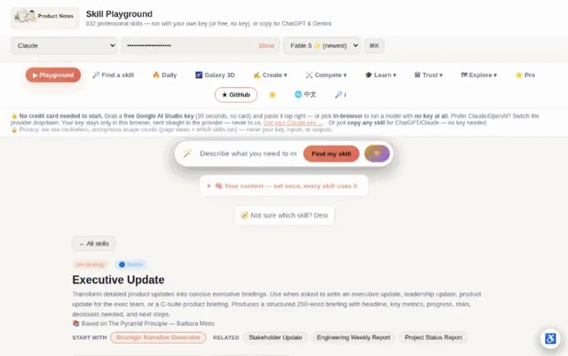
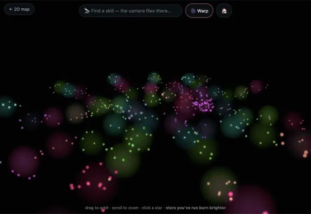
From the mohitagw15856/pm-claude-skills README — shows the whole collection, not only this skill. · view on GitHub
How to use it
Claude Code
- Run the line below. It pulls the whole folder into
~/.claude/skills/figma-design-brief. - Describe your job in plain words. Claude Code follows the skill from there.
npx degit mohitagw15856/pm-claude-skills/skills/figma-design-brief#main ~/.claude/skills/figma-design-briefFor one project only, change the path to .claude/skills/figma-design-brief.
Claude (web or desktop app)
- On this page open ⋯ → Download .md.
- Save it as SKILL.md in a folder, zip the folder, then Customize → Skills → + → Create skill → Upload a skill.
- Pick the file and Save. Claude shows the name and description and runs a security scan.
- Check the skill is switched on.
- Start a new chat and describe your job in plain words. The AI follows the skill from there.
ChatGPT or another app
- ChatGPT: make a Project and paste it into Instructions.
- Neither? Paste it at the top of a new chat — it works for that chat.
Not working?
- Check which app you pasted it into — the steps above name the right one.
- Some skills need the paid tier of Claude or ChatGPT.
Paste into Claude, ChatGPT or Cursor.
Source of Figma Design Brief Skill
Show the full text100 lines
| name | description |
|---|---|
| figma-design-brief | Write a structured design brief for a Figma design task from a product requirement or feature request. Use when asked to write a design brief, create a design spec for Figma, turn a PRD into design requirements, or brief a designer on what to build in Figma. Produces a brief with goals, scope, user flows, components needed, constraints, and success criteria. |
Figma Design Brief Skill
Converts a product requirement or feature request into a structured design brief — everything a designer needs to open Figma and start building confidently.
Required Inputs
- Feature or requirement (paste PRD snippet, ticket, or describe the feature)
- User goal (what is the user trying to accomplish?)
- Platform (iOS / Android / Web / Responsive / All)
- Existing components available (optional)
- Timeline (when does design need to be ready?)
Programmatic Helper
Contrast ratios cannot be eyeballed. The AA line sits at 4.5:1, and #777777
on white is 4.478 (fails) while #767676 is 4.54 (passes) — no amount of
looking at a screenshot separates those. Compute them:
npx --yes notugly fix "#8ab4f8" "#ffffff"     # ratio, APCA, and the nearest passing colour
npx --yes notugly onepager <url> --out review.html   # every pairing, printable
npx --yes notugly vision                      # which colours merge for colour-blind viewers
notugly fix returns the ratio, the APCA lightness contrast, and the closest
colour to the one already chosen that passes — same hue, same chroma. Paste
those numbers into the tables below rather than estimating them.
Deterministic, zero dependencies, and no model call — so it costs nothing to run and gives the same answer every time.
If the brief specifies colours, state the measured ratio for each intended text/background pairing. A brief that specifies an unreachable pairing wastes a design cycle before anybody notices.
Output Structure
1. Brief Header
Feature, PM, Designer, Platform, Design due, Dev handoff dates.
2. What We Are Designing and Why
- The goal: [One sentence — user problem being solved]
- Context: [2-3 sentences. Why now? What triggers this?]
- Success looks like: [Specific observable outcome]
3. User Flows to Design
Flow N: [Flow name]
- Entry point: [Where user starts]
- Steps: [Numbered key steps]
- Exit point: [Where flow ends]
- Edge cases: [empty state, error state, loading state]
4. Screens Required
| Screen | New / Update | Notes |
|---|---|---|
| [Screen] | New | [Key requirement] |
5. Components Needed
| Component | In library? | Action |
|---|---|---|
| [Component] | Yes/No/Needs variant | Use/Create/Extend |
6. Constraints and Requirements
- Must haves: [Non-negotiable constraints]
- Must avoid: [Design patterns to not use]
- Accessibility: [WCAG level, touch target sizes]
7. Open Questions
- [Question — with owner]
Quality Checks
- Goal is outcome-focused (not "design the feature")
- All flows include edge cases
- Components table identifies create vs reuse
- Constraints include accessibility requirements
- Open questions have owners
Anti-Patterns
- Do not write a design brief that describes the solution — the brief must describe the problem and constraints, not the design answer
- Do not skip the success criteria — designers need to know what "done" looks like before starting
- Do not omit existing components to reuse — briefs that ignore the design system lead to inconsistent implementations
- Do not leave open questions unresolved — escalate them before design work starts, not during it
- Do not confuse requirements with design instructions — the brief defines what, not how
Example Trigger Phrases
- "Write a design brief for [feature]"
- "Turn this PRD into a Figma design brief"
- "Brief the designer on what to build for [requirement]"
- "Create a design spec for [feature] for Figma"
- "What does the designer need to know to design [feature]?"
| 1 | |
| 2 | name figma-design-brief |
| 3 | description "Write a structured design brief for a Figma design task from a product requirement or feature request. Use when asked to write a design brief, create a design spec for Figma, turn a PRD into design requirements, or brief a designer on what to build in Figma. Produces a brief with goals, scope, user flows, components needed, constraints, and success criteria." |
| 4 | |
| 5 | |
| 6 | # Figma Design Brief Skill |
| 7 | |
| 8 | Converts a product requirement or feature request into a structured design brief — everything a designer needs to open Figma and start building confidently. |
| 9 | |
| 10 | ## Required Inputs |
| 11 | |
| 12 | **Feature or requirement** (paste PRD snippet, ticket, or describe the feature) |
| 13 | **User goal** (what is the user trying to accomplish?) |
| 14 | **Platform** (iOS / Android / Web / Responsive / All) |
| 15 | **Existing components available** (optional) |
| 16 | **Timeline** (when does design need to be ready?) |
| 17 | |
| 18 | |
| 19 | ## Programmatic Helper |
| 20 | |
| 21 | Contrast ratios cannot be eyeballed. The AA line sits at 4.5:1, and `#777777` |
| 22 | on white is 4.478 (fails) while `#767676` is 4.54 (passes) — no amount of |
| 23 | looking at a screenshot separates those. Compute them: |
| 24 | |
| 25 | |
| 26 | npx --yes notugly fix "#8ab4f8" "#ffffff" # ratio, APCA, and the nearest passing colour |
| 27 | npx --yes notugly onepager <url> --out review.html # every pairing, printable |
| 28 | npx --yes notugly vision # which colours merge for colour-blind viewers |
| 29 | |
| 30 | |
| 31 | `notugly fix` returns the ratio, the APCA lightness contrast, and the closest |
| 32 | colour to the one already chosen that passes — same hue, same chroma. Paste |
| 33 | those numbers into the tables below rather than estimating them. |
| 34 | |
| 35 | Deterministic, zero dependencies, and **no model call** — so it costs nothing to |
| 36 | run and gives the same answer every time. |
| 37 | |
| 38 | If the brief specifies colours, state the measured ratio for each intended |
| 39 | text/background pairing. A brief that specifies an unreachable pairing wastes a |
| 40 | design cycle before anybody notices. |
| 41 | |
| 42 | ## Output Structure |
| 43 | |
| 44 | ### 1. Brief Header |
| 45 | Feature, PM, Designer, Platform, Design due, Dev handoff dates. |
| 46 | |
| 47 | ### 2. What We Are Designing and Why |
| 48 | **The goal:** [One sentence — user problem being solved] |
| 49 | **Context:** [2-3 sentences. Why now? What triggers this?] |
| 50 | **Success looks like:** [Specific observable outcome] |
| 51 | |
| 52 | ### 3. User Flows to Design |
| 53 | |
| 54 | **Flow N: [Flow name]** |
| 55 | Entry point: [Where user starts] |
| 56 | Steps: [Numbered key steps] |
| 57 | Exit point: [Where flow ends] |
| 58 | Edge cases: [empty state, error state, loading state] |
| 59 | |
| 60 | ### 4. Screens Required |
| 61 | |
| 62 | | Screen | New / Update | Notes | |
| 63 | |---|---|---| |
| 64 | | [Screen] | New | [Key requirement] | |
| 65 | |
| 66 | ### 5. Components Needed |
| 67 | |
| 68 | | Component | In library? | Action | |
| 69 | |---|---|---| |
| 70 | | [Component] | Yes/No/Needs variant | Use/Create/Extend | |
| 71 | |
| 72 | ### 6. Constraints and Requirements |
| 73 | Must haves: [Non-negotiable constraints] |
| 74 | Must avoid: [Design patterns to not use] |
| 75 | Accessibility: [WCAG level, touch target sizes] |
| 76 | |
| 77 | ### 7. Open Questions |
| 78 | [ ] [Question — with owner] |
| 79 | |
| 80 | ## Quality Checks |
| 81 | [ ] Goal is outcome-focused (not "design the feature") |
| 82 | [ ] All flows include edge cases |
| 83 | [ ] Components table identifies create vs reuse |
| 84 | [ ] Constraints include accessibility requirements |
| 85 | [ ] Open questions have owners |
| 86 | |
| 87 | ## Anti-Patterns |
| 88 | |
| 89 | [ ] Do not write a design brief that describes the solution — the brief must describe the problem and constraints, not the design answer |
| 90 | [ ] Do not skip the success criteria — designers need to know what "done" looks like before starting |
| 91 | [ ] Do not omit existing components to reuse — briefs that ignore the design system lead to inconsistent implementations |
| 92 | [ ] Do not leave open questions unresolved — escalate them before design work starts, not during it |
| 93 | [ ] Do not confuse requirements with design instructions — the brief defines what, not how |
| 94 | |
| 95 | ## Example Trigger Phrases |
| 96 | "Write a design brief for [feature]" |
| 97 | "Turn this PRD into a Figma design brief" |
| 98 | "Brief the designer on what to build for [requirement]" |
| 99 | "Create a design spec for [feature] for Figma" |
| 100 | "What does the designer need to know to design [feature]?" |
Discussion
Browse more free Claude skills or everything in Design.