Figma Component Audit Skill
Audit a Figma component library for consistency, coverage gaps, and naming issues.
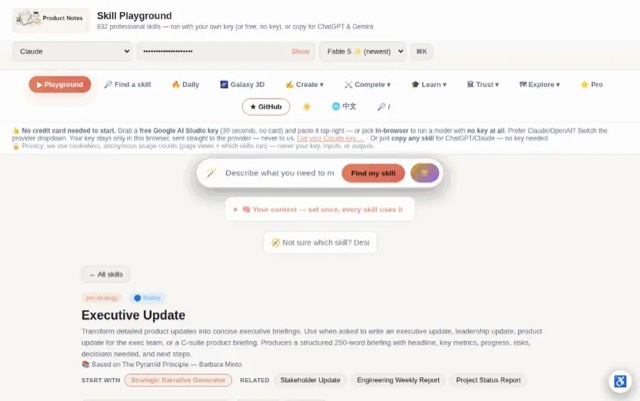
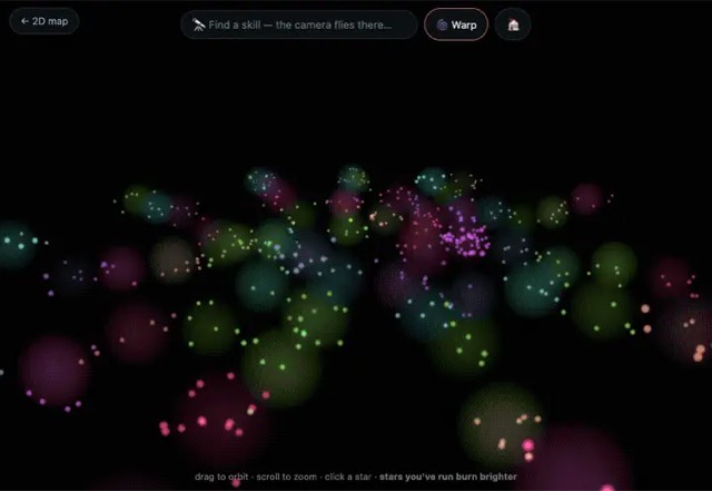
From the mohitagw15856/pm-claude-skills README — shows the whole collection, not only this skill. · view on GitHub
How to use it
Claude Code
- Run the line below. It pulls the whole folder into
~/.claude/skills/figma-component-audit. - Describe your job in plain words. Claude Code follows the skill from there.
Claude Code — installs the whole folder, not just SKILL.md
npx degit mohitagw15856/pm-claude-skills/skills/figma-component-audit#main ~/.claude/skills/figma-component-auditFor one project only, change the path to .claude/skills/figma-component-audit.
Claude (web or desktop app)
- On this page open ⋯ → Download .md.
- Save it as SKILL.md in a folder, zip the folder, then Customize → Skills → + → Create skill → Upload a skill.
- Pick the file and Save. Claude shows the name and description and runs a security scan.
- Check the skill is switched on.
- Start a new chat and describe your job in plain words. The AI follows the skill from there.
ChatGPT or another app
- ChatGPT: make a Project and paste it into Instructions.
- Neither? Paste it at the top of a new chat — it works for that chat.
Not working?
- Check which app you pasted it into — the steps above name the right one.
- Some skills need the paid tier of Claude or ChatGPT.
Paste into Claude, ChatGPT or Cursor.
Source of Figma Component Audit Skill
Show the full text82 lines
| name | description |
|---|---|
| figma-component-audit | Audit a Figma component library for consistency, coverage gaps, and naming issues. Use when asked to audit components, review a design system, check component consistency, identify missing components, or assess Figma library health. Produces a structured audit report with issues prioritised by impact, naming recommendations, and a fix plan. |
Figma Component Audit Skill
Produces a structured audit of a Figma component library — identifying inconsistencies, naming problems, coverage gaps, and prioritised recommendations.
Required Inputs
- Component list or description (paste component names or describe what exists)
- Product type (mobile app / web app / desktop / multi-platform)
- Design system maturity (new / growing / mature / legacy)
- Primary concern (optional)
Output Structure
1. Audit Summary
| Dimension | Status | Score |
|---|---|---|
| Naming consistency | Red/Amber/Green | /10 |
| Component coverage | /10 | |
| Variant completeness | /10 | |
| Documentation | /10 | |
| Overall health | /10 |
Verdict: What is the state of this library and the single most important thing to fix?
2. Naming Issues
For each problem: Issue: [Problem type]
- What is happening: [Specific examples]
- Why it matters: [Impact on designers and developers]
- Fix: [Exact naming convention to adopt]
- Examples: Before / After
Naming convention to enforce:
- Components: PascalCase (NavigationBar)
- Variants: Lowercase with slashes (size/large, state/hover)
- Pages: All caps (COMPONENTS, FOUNDATIONS)
3. Coverage Gaps
| Missing Component | Priority | Why Needed |
|---|---|---|
| [Component] | High/Medium/Low | [Use case] |
4. Variant Completeness Check
| Component | Default | Hover | Active | Disabled | Error | Missing |
|---|---|---|---|---|---|---|
| [Button] | Yes | Yes | No | Yes | No | Active, Error |
5. Prioritised Fix Plan
| # | Fix | Effort | Impact | Do First? |
|---|---|---|---|---|
| 1 | [Fix] | Low/Med/High | High | Yes |
Quality Checks
- Naming recommendations have before/after examples
- Coverage gaps are relevant to the product type
- Fix plan is ordered by impact-to-effort ratio
- Variant completeness covers all interactive states
Anti-Patterns
- Do not flag naming issues without providing a specific, consistent naming convention to adopt
- Do not audit only visual consistency — also check for missing interactive states and accessibility compliance
- Do not list all issues at equal priority — group by impact (Critical / Major / Minor) so the fix plan is actionable
- Do not omit variant completeness — every interactive component must cover all required states
- Do not leave coverage gaps without recommending specific missing components to add
Example Trigger Phrases
- "Audit my Figma component library"
- "Review our design system for consistency issues"
- "What components are we missing in our Figma library?"
- "Our component naming is a mess — help me fix it"
- "Do a health check on our Figma components"
| 1 | |
| 2 | name figma-component-audit |
| 3 | description "Audit a Figma component library for consistency, coverage gaps, and naming issues. Use when asked to audit components, review a design system, check component consistency, identify missing components, or assess Figma library health. Produces a structured audit report with issues prioritised by impact, naming recommendations, and a fix plan." |
| 4 | |
| 5 | |
| 6 | # Figma Component Audit Skill |
| 7 | |
| 8 | Produces a structured audit of a Figma component library — identifying inconsistencies, naming problems, coverage gaps, and prioritised recommendations. |
| 9 | |
| 10 | ## Required Inputs |
| 11 | |
| 12 | **Component list or description** (paste component names or describe what exists) |
| 13 | **Product type** (mobile app / web app / desktop / multi-platform) |
| 14 | **Design system maturity** (new / growing / mature / legacy) |
| 15 | **Primary concern** (optional) |
| 16 | |
| 17 | ## Output Structure |
| 18 | |
| 19 | ### 1. Audit Summary |
| 20 | |
| 21 | | Dimension | Status | Score | |
| 22 | |---|---|---| |
| 23 | | Naming consistency | Red/Amber/Green | /10 | |
| 24 | | Component coverage | | /10 | |
| 25 | | Variant completeness | | /10 | |
| 26 | | Documentation | | /10 | |
| 27 | | Overall health | | /10 | |
| 28 | |
| 29 | **Verdict:** What is the state of this library and the single most important thing to fix? |
| 30 | |
| 31 | ### 2. Naming Issues |
| 32 | |
| 33 | For each problem: |
| 34 | **Issue: [Problem type]** |
| 35 | What is happening: [Specific examples] |
| 36 | Why it matters: [Impact on designers and developers] |
| 37 | Fix: [Exact naming convention to adopt] |
| 38 | Examples: Before / After |
| 39 | |
| 40 | Naming convention to enforce: |
| 41 | Components: PascalCase (NavigationBar) |
| 42 | Variants: Lowercase with slashes (size/large, state/hover) |
| 43 | Pages: All caps (COMPONENTS, FOUNDATIONS) |
| 44 | |
| 45 | ### 3. Coverage Gaps |
| 46 | |
| 47 | | Missing Component | Priority | Why Needed | |
| 48 | |---|---|---| |
| 49 | | [Component] | High/Medium/Low | [Use case] | |
| 50 | |
| 51 | ### 4. Variant Completeness Check |
| 52 | |
| 53 | | Component | Default | Hover | Active | Disabled | Error | Missing | |
| 54 | |---|---|---|---|---|---|---| |
| 55 | | [Button] | Yes | Yes | No | Yes | No | Active, Error | |
| 56 | |
| 57 | ### 5. Prioritised Fix Plan |
| 58 | |
| 59 | | # | Fix | Effort | Impact | Do First? | |
| 60 | |---|---|---|---|---| |
| 61 | | 1 | [Fix] | Low/Med/High | High | Yes | |
| 62 | |
| 63 | ## Quality Checks |
| 64 | [ ] Naming recommendations have before/after examples |
| 65 | [ ] Coverage gaps are relevant to the product type |
| 66 | [ ] Fix plan is ordered by impact-to-effort ratio |
| 67 | [ ] Variant completeness covers all interactive states |
| 68 | |
| 69 | ## Anti-Patterns |
| 70 | |
| 71 | [ ] Do not flag naming issues without providing a specific, consistent naming convention to adopt |
| 72 | [ ] Do not audit only visual consistency — also check for missing interactive states and accessibility compliance |
| 73 | [ ] Do not list all issues at equal priority — group by impact (Critical / Major / Minor) so the fix plan is actionable |
| 74 | [ ] Do not omit variant completeness — every interactive component must cover all required states |
| 75 | [ ] Do not leave coverage gaps without recommending specific missing components to add |
| 76 | |
| 77 | ## Example Trigger Phrases |
| 78 | "Audit my Figma component library" |
| 79 | "Review our design system for consistency issues" |
| 80 | "What components are we missing in our Figma library?" |
| 81 | "Our component naming is a mess — help me fix it" |
| 82 | "Do a health check on our Figma components" |
Discussion
Frontend designGuidance for distinctive, intentional visual design when building new UI or reshaping an existing one. Helps with aesthetic direction, typography, and making choices that don't read as templated defaults.ImpeccableUse when the user wants to design, redesign, shape, critique, audit, polish, clarify, distill, harden, optimize, adapt, animate, colorize, extract, or otherwise improve a frontend interface. Covers websites, landing pages, dashboards, product UI, app shells, components, forms, settings, onboarding, and empty states. Handles UX review, visual hierarchy, information architecture, cognitive load, accessibility, performance, responsive behavior, theming, anti-patterns, typography, fonts, spacing, layout, alignment, color, motion, micro-interactions, UX copy, error states, edge cases, i18n, and reusable design systems or tokens. Also use for bland designs that need to become bolder or more delightful, loud designs that should become quieter, live browser iteration on UI elements, or ambitious visual effects that should feel technically extraordinary. Not for backend-only or non-UI tasks.Apple designApple's approach to interface design and fluid, physical motion, translated for the web. Use when building or reviewing gesture-driven UI, spring animations, drag/swipe/sheet interactions, momentum and interruptible transitions, translucent materials and depth, typography (optical sizing, tracking, leading), reduced-motion, or the design foundations (feedback, spatial consistency, restraint) behind Apple-style interfaces.Building AnimationsBuild an animation from scratch, making the decisions in the order that determines whether it feels right — should it animate at all, what purpose, which tool, which properties, which curve and duration, how it interrupts, how it exits. Writes the implementation. Use when asked to animate something, add motion, make a component feel alive, or build a transition. For critiquing existing motion use review-animations; for auditing a whole codebase use improve-animations.
Browse more free Claude skills or everything in Design.