Figma Annotation Guide Skill
Generate structured developer handoff annotations for a Figma screen or component.
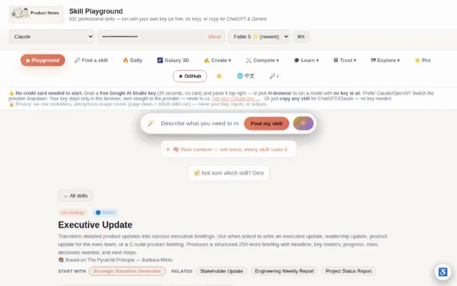
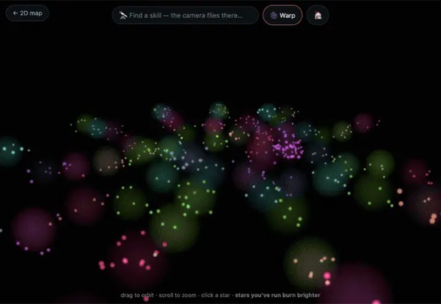
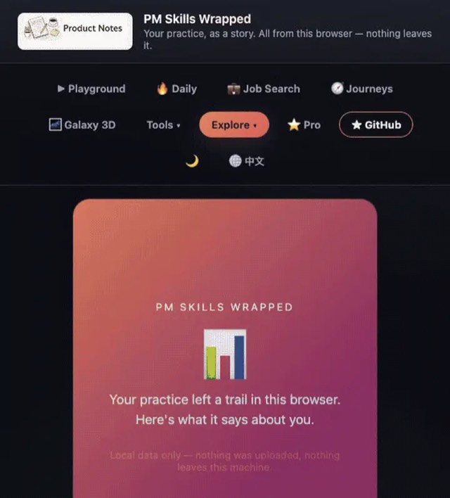
From the mohitagw15856/pm-claude-skills README — shows the whole collection, not only this skill. · view on GitHub
How to use it
Claude Code
- Run the line below. It pulls the whole folder into
~/.claude/skills/figma-annotation-guide. - Describe your job in plain words. Claude Code follows the skill from there.
npx degit mohitagw15856/pm-claude-skills/skills/figma-annotation-guide#main ~/.claude/skills/figma-annotation-guideFor one project only, change the path to .claude/skills/figma-annotation-guide.
Claude (web or desktop app)
- On this page open ⋯ → Download .md.
- Save it as SKILL.md in a folder, zip the folder, then Customize → Skills → + → Create skill → Upload a skill.
- Pick the file and Save. Claude shows the name and description and runs a security scan.
- Check the skill is switched on.
- Start a new chat and describe your job in plain words. The AI follows the skill from there.
ChatGPT or another app
- ChatGPT: make a Project and paste it into Instructions.
- Neither? Paste it at the top of a new chat — it works for that chat.
Not working?
- Check which app you pasted it into — the steps above name the right one.
- Some skills need the paid tier of Claude or ChatGPT.
Paste into Claude, ChatGPT or Cursor.
Source of Figma Annotation Guide Skill
Show the full text96 lines
| name | description |
|---|---|
| figma-annotation-guide | Generate structured developer handoff annotations for a Figma screen or component. Use when asked to write Figma annotations, create dev handoff notes, document a Figma design for developers, or write specs for a screen. Produces a complete annotation set covering interactions, states, spacing, accessibility, and edge cases. |
Figma Annotation Guide Skill
Produces a complete set of developer handoff annotations for a Figma screen or component — the notes that turn a visual design into a buildable spec.
Required Inputs
- Screen or component description (describe or summarise what was designed)
- Platform (iOS / Android / Web / React Native)
- Interaction type (static / interactive / animated / form)
- Developer audience (mobile / frontend / full-stack)
Programmatic Helper
Contrast ratios cannot be eyeballed. The AA line sits at 4.5:1, and #777777
on white is 4.478 (fails) while #767676 is 4.54 (passes) — no amount of
looking at a screenshot separates those. Compute them:
npx --yes notugly fix "#8ab4f8" "#ffffff"     # ratio, APCA, and the nearest passing colour
npx --yes notugly onepager <url> --out review.html   # every pairing, printable
npx --yes notugly vision                      # which colours merge for colour-blind viewers
notugly fix returns the ratio, the APCA lightness contrast, and the closest
colour to the one already chosen that passes — same hue, same chroma. Paste
those numbers into the tables below rather than estimating them.
Deterministic, zero dependencies, and no model call — so it costs nothing to run and gives the same answer every time.
Contrast annotations should carry the computed ratio and the target, e.g. "4.52:1 — passes AA for body text". An annotation that says "check contrast" is a task, not an annotation.
Output Structure
1. Screen/Component Overview
Name, purpose, entry points, exit points.
2. Interaction Annotations
[Element name]
- Default state: [Visual description]
- On tap/click: [Exact action — API call, state change, navigation]
- Loading state: [Description]
- Success state: [What happens after]
- Error state: [What error looks like and user options]
- Disabled condition: [When and why]
3. State Inventory
| Element | States Required |
|---|---|
| [Element] | Default, Hover, Active, Disabled, Loading, Error, Empty |
Flag missing designs: "Warning: Error state not designed — needed before build"
4. Spacing and Layout Notes
Fixed vs fluid elements, scroll behaviour, breakpoints, safe areas.
5. Content and Copy Rules
Character limits, dynamic vs static content, truncation rules, empty states.
6. Accessibility Annotations
Touch targets, screen reader labels, focus order, colour contrast, motion preferences.
7. Edge Cases and Developer Questions
- [Unresolved question for developer to flag]
Quality Checks
- Every interactive element has all states defined
- State inventory flags missing designs
- Accessibility covers touch targets and screen reader labels
- Empty states specified
- Edge cases listed as actionable questions
Anti-Patterns
- Do not annotate only the happy path — error states, loading states, and empty states must all be documented
- Do not use vague spacing descriptions like "some padding" — specify exact pixel values or token names
- Do not skip accessibility annotations — focus order, ARIA labels, and colour contrast ratios must be included
- Do not leave interaction behaviour undescribed — every interactive element needs a documented response
- Do not produce annotations without edge cases — developers need to know what happens at boundaries
Example Trigger Phrases
- "Write dev annotations for this Figma screen"
- "Create developer handoff notes for [screen/component]"
- "Document this design for the engineering team"
- "Write the Figma spec for [feature]"
- "What should I annotate before handing off this design?"
| 1 | |
| 2 | name figma-annotation-guide |
| 3 | description "Generate structured developer handoff annotations for a Figma screen or component. Use when asked to write Figma annotations, create dev handoff notes, document a Figma design for developers, or write specs for a screen. Produces a complete annotation set covering interactions, states, spacing, accessibility, and edge cases." |
| 4 | |
| 5 | |
| 6 | # Figma Annotation Guide Skill |
| 7 | |
| 8 | Produces a complete set of developer handoff annotations for a Figma screen or component — the notes that turn a visual design into a buildable spec. |
| 9 | |
| 10 | ## Required Inputs |
| 11 | |
| 12 | **Screen or component description** (describe or summarise what was designed) |
| 13 | **Platform** (iOS / Android / Web / React Native) |
| 14 | **Interaction type** (static / interactive / animated / form) |
| 15 | **Developer audience** (mobile / frontend / full-stack) |
| 16 | |
| 17 | |
| 18 | ## Programmatic Helper |
| 19 | |
| 20 | Contrast ratios cannot be eyeballed. The AA line sits at 4.5:1, and `#777777` |
| 21 | on white is 4.478 (fails) while `#767676` is 4.54 (passes) — no amount of |
| 22 | looking at a screenshot separates those. Compute them: |
| 23 | |
| 24 | |
| 25 | npx --yes notugly fix "#8ab4f8" "#ffffff" # ratio, APCA, and the nearest passing colour |
| 26 | npx --yes notugly onepager <url> --out review.html # every pairing, printable |
| 27 | npx --yes notugly vision # which colours merge for colour-blind viewers |
| 28 | |
| 29 | |
| 30 | `notugly fix` returns the ratio, the APCA lightness contrast, and the closest |
| 31 | colour to the one already chosen that passes — same hue, same chroma. Paste |
| 32 | those numbers into the tables below rather than estimating them. |
| 33 | |
| 34 | Deterministic, zero dependencies, and **no model call** — so it costs nothing to |
| 35 | run and gives the same answer every time. |
| 36 | |
| 37 | Contrast annotations should carry the computed ratio and the target, e.g. |
| 38 | "4.52:1 — passes AA for body text". An annotation that says "check contrast" is |
| 39 | a task, not an annotation. |
| 40 | |
| 41 | ## Output Structure |
| 42 | |
| 43 | ### 1. Screen/Component Overview |
| 44 | Name, purpose, entry points, exit points. |
| 45 | |
| 46 | ### 2. Interaction Annotations |
| 47 | |
| 48 | **[Element name]** |
| 49 | Default state: [Visual description] |
| 50 | On tap/click: [Exact action — API call, state change, navigation] |
| 51 | Loading state: [Description] |
| 52 | Success state: [What happens after] |
| 53 | Error state: [What error looks like and user options] |
| 54 | Disabled condition: [When and why] |
| 55 | |
| 56 | ### 3. State Inventory |
| 57 | |
| 58 | | Element | States Required | |
| 59 | |---|---| |
| 60 | | [Element] | Default, Hover, Active, Disabled, Loading, Error, Empty | |
| 61 | |
| 62 | Flag missing designs: "Warning: Error state not designed — needed before build" |
| 63 | |
| 64 | ### 4. Spacing and Layout Notes |
| 65 | Fixed vs fluid elements, scroll behaviour, breakpoints, safe areas. |
| 66 | |
| 67 | ### 5. Content and Copy Rules |
| 68 | Character limits, dynamic vs static content, truncation rules, empty states. |
| 69 | |
| 70 | ### 6. Accessibility Annotations |
| 71 | Touch targets, screen reader labels, focus order, colour contrast, motion preferences. |
| 72 | |
| 73 | ### 7. Edge Cases and Developer Questions |
| 74 | [ ] [Unresolved question for developer to flag] |
| 75 | |
| 76 | ## Quality Checks |
| 77 | [ ] Every interactive element has all states defined |
| 78 | [ ] State inventory flags missing designs |
| 79 | [ ] Accessibility covers touch targets and screen reader labels |
| 80 | [ ] Empty states specified |
| 81 | [ ] Edge cases listed as actionable questions |
| 82 | |
| 83 | ## Anti-Patterns |
| 84 | |
| 85 | [ ] Do not annotate only the happy path — error states, loading states, and empty states must all be documented |
| 86 | [ ] Do not use vague spacing descriptions like "some padding" — specify exact pixel values or token names |
| 87 | [ ] Do not skip accessibility annotations — focus order, ARIA labels, and colour contrast ratios must be included |
| 88 | [ ] Do not leave interaction behaviour undescribed — every interactive element needs a documented response |
| 89 | [ ] Do not produce annotations without edge cases — developers need to know what happens at boundaries |
| 90 | |
| 91 | ## Example Trigger Phrases |
| 92 | "Write dev annotations for this Figma screen" |
| 93 | "Create developer handoff notes for [screen/component]" |
| 94 | "Document this design for the engineering team" |
| 95 | "Write the Figma spec for [feature]" |
| 96 | "What should I annotate before handing off this design?" |
Discussion
Browse more free Claude skills or everything in Design.