Design System Audit Skill
Audit a design system for consistency, coverage, and quality.
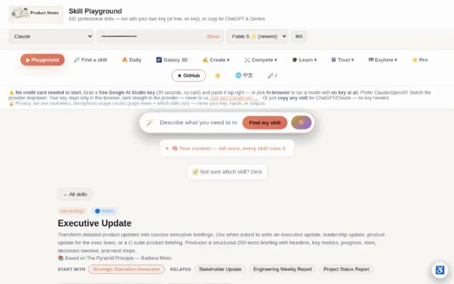
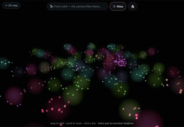
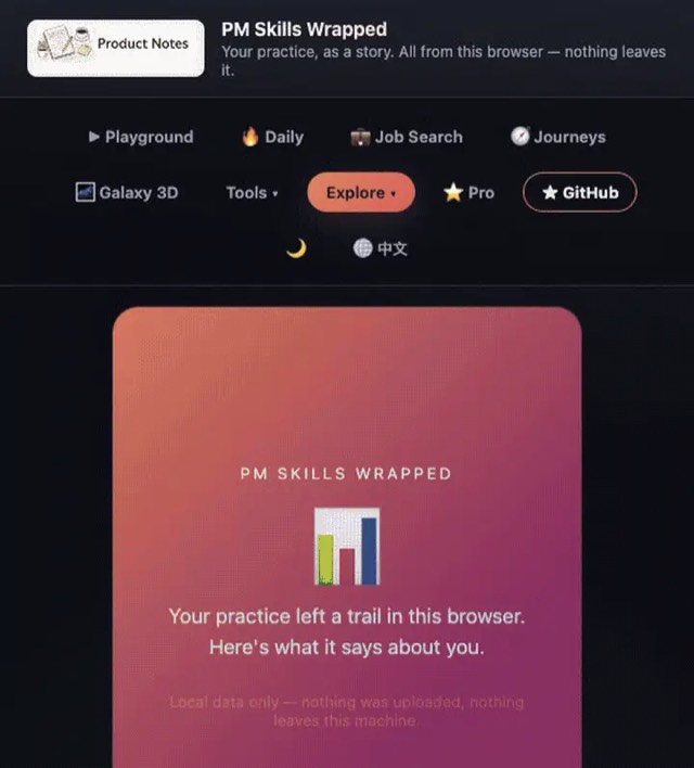
From the mohitagw15856/pm-claude-skills README — shows the whole collection, not only this skill. · view on GitHub
How to use it
Claude Code
- Run the line below. It pulls the whole folder into
~/.claude/skills/design-system-audit, including the files SKILL.md points to. - Describe your job in plain words. Claude Code follows the skill from there.
npx degit mohitagw15856/pm-claude-skills/skills/design-system-audit#main ~/.claude/skills/design-system-auditFor one project only, change the path to .claude/skills/design-system-audit. This skill also uses tokens.json, baseline.json — copying SKILL.md alone won't be enough. See the folder on GitHub.
Claude (web or desktop app)
- On this page open ⋯ → Download .md.
- Save it as SKILL.md in a folder, zip the folder, then Customize → Skills → + → Create skill → Upload a skill.
- Pick the file and Save. Claude shows the name and description and runs a security scan.
- Check the skill is switched on.
- Start a new chat and describe your job in plain words. The AI follows the skill from there.
ChatGPT or another app
- ChatGPT: make a Project and paste it into Instructions.
- Neither? Paste it at the top of a new chat — it works for that chat.
Not working?
- Check which app you pasted it into — the steps above name the right one.
- Some skills need the paid tier of Claude or ChatGPT.
Paste into Claude, ChatGPT or Cursor.
Source of Design System Audit Skill
Show the full text260 lines
| name | description |
|---|---|
| design-system-audit | Audit a design system for consistency, coverage, and quality. Use when asked to audit a design system, review a component library, assess design token coverage, or evaluate the health of a shared design system. Produces a structured audit with a health score, component coverage gaps, token inconsistencies, accessibility issues, and a prioritised remediation roadmap. |
Design System Audit Skill
This skill produces a structured audit of a design system — covering component coverage, token consistency, documentation quality, accessibility compliance, contribution processes, and adoption health. Output is ready for a design system team, design leadership, or an engineering team evaluating their shared component library.
Required Inputs
Ask the user for these if not provided:
- Design system name and what product(s) it serves
- Audit scope — component library / design tokens / documentation / contribution process / all of the above
- Current tooling — Figma / Storybook / Zeroheight / custom / combination?
- Team using it — how many designers and engineers, how many products?
- Known pain points — what do teams complain about most?
- Governance model — centralised team / federated contributors / no dedicated team?
- Goal of the audit — improve adoption / prepare for a rebrand / onboard new teams / justify investment?
Programmatic Helper
Contrast ratios cannot be eyeballed. The AA line sits at 4.5:1, and #777777
on white is 4.478 (fails) while #767676 is 4.54 (passes) — no amount of
looking at a screenshot separates those. Compute them:
npx --yes notugly fix "#8ab4f8" "#ffffff"     # ratio, APCA, and the nearest passing colour
npx --yes notugly onepager <url> --out review.html   # every pairing, printable
npx --yes notugly vision                      # which colours merge for colour-blind viewers
notugly fix returns the ratio, the APCA lightness contrast, and the closest
colour to the one already chosen that passes — same hue, same chroma. Paste
those numbers into the tables below rather than estimating them.
Deterministic, zero dependencies, and no model call — so it costs nothing to run and gives the same answer every time.
For the token consistency and accessibility sections, point it at the token file directly:
npx --yes notugly tokens tokens.json # W3C design tokens or a Figma variables export
That names the failing pairs semantically — color.text.danger on surface.default is 2.99:1 — needs 4.5 — which is a bug with an owner, rather
than a general note about contrast. It also flags one colour defined under
several token names, which is the usual sign a system grew by copy-paste.
For drift over time, npx notugly watch <url> baseline.json distinguishes "a
new colour" from "a colour 0.003 away from one that already existed, because
somebody could not find the token".
Output Structure
Design System Audit: [System Name]
Products served: [List of products / apps] Audit scope: [Full / Components only / Tokens only / Documentation] Auditor: [Name / Team] Date: [Date] Stakeholders: [Design lead, Eng lead, CPO, etc.]
Overall Health Score
| Dimension | Score (1–5) | Status |
|---|---|---|
| Component coverage | [X/5] | 🟢/🟡/🔴 |
| Token consistency | [X/5] | 🟢/🟡/🔴 |
| Documentation quality | [X/5] | 🟢/🟡/🔴 |
| Accessibility compliance | [X/5] | 🟢/🟡/🔴 |
| Adoption rate | [X/5] | 🟢/🟡/🔴 |
| Contribution process | [X/5] | 🟢/🟡/🔴 |
| Overall | [X/5] | 🟢/🟡/🔴 |
Summary: [2–3 sentences. What is the overall state of the design system? What are the top 2 issues and what is the biggest strength?]
1. Component Coverage Audit
How to assess: Compare components in the design system against the actual UI patterns in the product. Every pattern that exists in production but not in the system is a coverage gap.
Component Inventory
| Category | Components present | Coverage | Gap |
|---|---|---|---|
| Navigation | [Navbar, Sidebar, Breadcrumb, Tabs] | [80%] | [Missing: Mega menu, mobile drawer] |
| Forms & Inputs | [Text input, Dropdown, Checkbox, Radio, Toggle, Date picker] | [90%] | [Missing: Multi-select, Rich text editor] |
| Feedback & Alerts | [Toast, Banner, Modal, Tooltip] | [60%] | [Missing: Inline validation, Progress indicator, Skeleton loader] |
| Data Display | [Table, Card, Badge, Avatar] | [50%] | [Missing: Data grid, Stat card, Timeline, Gantt] |
| Layout | [Grid, Container, Divider, Spacer] | [70%] | [Missing: Responsive breakpoint utilities] |
| Buttons & Actions | [Button, Icon button, FAB, Link] | [100%] | [None] |
Coverage score: [X% of production UI patterns are covered by the design system]
Most impactful gaps:
- [Most used pattern not in the system — causing most duplication]
- [...]
- [...]
2. Component Quality Audit
For each component, assess against these quality criteria:
| Component | States complete | Responsive | Accessibility | Dark mode | Props documented | Code matches Figma |
|---|---|---|---|---|---|---|
| Button | ✅ | ✅ | ✅ | ✅ | ✅ | ✅ |
| Modal | ⚠️ Loading state missing | ✅ | ✅ | ❌ | ⚠️ Partial | ✅ |
| Table | ❌ Sorting state missing | ❌ No mobile layout | ⚠️ No aria-sort | ❌ | ❌ | ⚠️ Drift |
| [Component] | [...] | [...] | [...] | [...] | [...] | [...] |
Legend: ✅ Complete — ⚠️ Partial / inconsistent — ❌ Missing
Components with critical quality issues (fix before anything else):
- [Component name]: [Specific issue and why it's blocking]
- [...]
3. Design Token Audit
Token coverage:
| Token type | Defined | Used consistently | Issues |
|---|---|---|---|
| Colour | [X tokens defined] | [⚠️ — 12 hardcoded hex values found in Figma] | [Inconsistent use of primary-500 vs primary-600 for CTAs across products] |
| Typography | [X tokens defined] | [✅] | [None — all type styles use token scale] |
| Spacing | [X tokens defined] | [⚠️ — custom spacing used in X components] | [Engineers using arbitrary px values instead of spacing tokens in X components] |
| Border radius | [X tokens defined] | [❌ — not defined; each component has hardcoded values] | [Button, card, modal all use different radius values with no token] |
| Shadow / elevation | [X tokens defined] | [⚠️] | [3 different drop-shadow values in use; no elevation scale] |
| Animation / motion | [X tokens defined] | [❌ — not defined] | [Transition durations inconsistent across components] |
Semantic token layer: [Does the system have semantic tokens (e.g. color.action.primary on top of color.blue.500) or only primitive tokens?]
Token drift: [Are code tokens and Figma tokens in sync? Use a tool like Token Studio, Style Dictionary, or manual comparison.]
4. Documentation Quality Audit
Assessment per component / pattern:
| Document type | Quality | Issues |
|---|---|---|
| Usage guidelines | [⚠️ — X% of components have guidelines] | [Button and Form components documented; Navigation and Data Display mostly undocumented] |
| Do / Don't examples | [❌ — mostly absent] | [Engineers frequently misuse components because intent is unclear] |
| Accessibility notes | [⚠️ — present for some components] | [No consistent format; accessibility notes missing for interactive components] |
| Code examples | [✅ — all Storybook components have code examples] | [...] |
| Changelog | [❌ — no component-level changelog exists] | [Breaking changes are not communicated; causes unexpected UI regressions] |
| Migration guides | [❌ — absent] | [Teams don't know how to upgrade to new component versions] |
Documentation score: [X% of components have complete, usable documentation]
Most common designer / engineer complaint about docs: [e.g. "I can't find whether to use Modal or Drawer for this use case — no guidance exists"]
5. Accessibility Audit
WCAG 2.2 compliance status:
| Criterion | Level | Status | Components affected |
|---|---|---|---|
| Colour contrast (text) | AA | [✅ / ⚠️ / ❌] | [e.g. ❌ — Disabled state text fails 4.5:1 ratio in 3 components] |
| Colour contrast (UI components) | AA | [✅ / ⚠️ / ❌] | [...] |
| Keyboard navigation | AA | [✅ / ⚠️ / ❌] | [⚠️ — Modal focus trap not implemented; Dropdown not keyboard accessible] |
| Focus visible | AA | [✅ / ⚠️ / ❌] | [...] |
| Screen reader support (ARIA) | AA | [✅ / ⚠️ / ❌] | [❌ — Table component lacks aria-sort; Icon buttons have no aria-label] |
| Touch target size | AA | [✅ / ⚠️ / ❌] | [⚠️ — Mobile tap targets below 44×44px in X components] |
| Motion / animation | AA | [✅ / ⚠️ / ❌] | [...] |
Critical accessibility blockers (must fix before next release):
- [Most critical issue — e.g. Keyboard users cannot close Modal — focus trap missing]
- [...]
6. Adoption Audit
Adoption by team / product:
| Product / Team | Components used from system | Custom components built outside system | Adoption score |
|---|---|---|---|
| [Product A] | [X% of UI uses system components] | [Y custom components] | [High / Medium / Low] |
| [Product B] | [...] | [...] | [...] |
Why teams are not adopting:
| Barrier | Severity | Evidence |
|---|---|---|
| [Component doesn't exist] | High | [Top reason in team survey] |
| [Component exists but doesn't meet use case] | Medium | [Modal component lacks X state needed by Product B] |
| [Documentation too sparse to know how to use it] | Medium | [...] |
| [No one enforces system use — easier to build custom] | High | [...] |
| [System is out of date with product's current visual language] | Medium | [...] |
7. Contribution Process Audit
| Dimension | Current state | Assessment |
|---|---|---|
| How to contribute | [Documented / Not documented] | [✅ / ❌] |
| Contribution criteria | [Clear entry bar for what goes in the system] | [⚠️ — unclear who decides what becomes a system component vs stays local] |
| Review process | [Who reviews contributions and how long it takes] | [❌ — no formal review; contributions sit unreviewed for weeks] |
| Release cadence | [How often system releases happen] | [⚠️ — sporadic; no set cadence] |
| Breaking change policy | [How breaking changes are handled and communicated] | [❌ — no policy; breaking changes are a surprise] |
| Versioning | [Semantic versioning in place?] | [✅ — all packages use semver] |
8. Prioritised Remediation Roadmap
| Priority | Initiative | Impact | Effort | Timeline |
|---|---|---|---|---|
| P1 | Fix [X] critical accessibility issues (keyboard nav, ARIA) | Critical — legal + user impact | Medium | Sprint 1–2 |
| P1 | Define and implement border radius and shadow token scale | High — ends inconsistency | Low | Sprint 1 |
| P1 | Document top 10 most-used components (usage + do/don't) | High — unblocks adoption | Medium | Sprint 2–4 |
| P2 | Build Skeleton loader + Inline validation components (top 2 gaps) | High — eliminates custom duplication | High | Quarter 2 |
| P2 | Establish contribution process with SLA for reviews | Medium — enables growth | Low | Sprint 3 |
| P3 | Dark mode token support | Medium — product parity | High | Quarter 3 |
| P3 | Design-code token sync tooling (Token Studio / Style Dictionary) | Medium — reduces drift | Medium | Quarter 2–3 |
Quality Checks
- Coverage gaps are identified by comparing the design system to actual production UI, not assumed
- Accessibility issues cite specific WCAG criterion and affected components
- Adoption barriers are backed by evidence (interviews, survey, usage data) — not assumed
- Remediation roadmap has effort estimates and is sequenced by impact
- Both Figma and code (Storybook/implementation) are assessed — not just Figma
- Stakeholders from design, engineering, and product have reviewed the audit
Anti-Patterns
- Do not assess only the Figma library without checking the code implementation — Figma-code drift is one of the most common and costly design system failures
- Do not score adoption without interviewing teams — audit tool metrics miss the human reasons teams build custom components instead of using the system
- Do not treat all component gaps equally — prioritise gaps based on how many production screens rely on custom implementations, not alphabetically
- Do not recommend adding more components without first auditing documentation quality — an undocumented component is often worse than no component
- Do not schedule remediation without a named owner per initiative — design system improvements without ownership consistently stall
Example Trigger Phrases
- "Audit our design system for consistency and coverage"
- "Review our component library and identify gaps"
- "Assess the health of our shared design system"
- "Run a design system audit before we do a rebrand"
- "What's wrong with our design system and what should we fix first?"
| 1 | |
| 2 | name design-system-audit |
| 3 | description "Audit a design system for consistency, coverage, and quality. Use when asked to audit a design system, review a component library, assess design token coverage, or evaluate the health of a shared design system. Produces a structured audit with a health score, component coverage gaps, token inconsistencies, accessibility issues, and a prioritised remediation roadmap." |
| 4 | |
| 5 | |
| 6 | # Design System Audit Skill |
| 7 | |
| 8 | This skill produces a structured audit of a design system — covering component coverage, token consistency, documentation quality, accessibility compliance, contribution processes, and adoption health. Output is ready for a design system team, design leadership, or an engineering team evaluating their shared component library. |
| 9 | |
| 10 | ## Required Inputs |
| 11 | |
| 12 | Ask the user for these if not provided: |
| 13 | **Design system name** and what product(s) it serves |
| 14 | **Audit scope** — component library / design tokens / documentation / contribution process / all of the above |
| 15 | **Current tooling** — Figma / Storybook / Zeroheight / custom / combination? |
| 16 | **Team using it** — how many designers and engineers, how many products? |
| 17 | **Known pain points** — what do teams complain about most? |
| 18 | **Governance model** — centralised team / federated contributors / no dedicated team? |
| 19 | **Goal of the audit** — improve adoption / prepare for a rebrand / onboard new teams / justify investment? |
| 20 | |
| 21 | |
| 22 | ## Programmatic Helper |
| 23 | |
| 24 | Contrast ratios cannot be eyeballed. The AA line sits at 4.5:1, and `#777777` |
| 25 | on white is 4.478 (fails) while `#767676` is 4.54 (passes) — no amount of |
| 26 | looking at a screenshot separates those. Compute them: |
| 27 | |
| 28 | |
| 29 | npx --yes notugly fix "#8ab4f8" "#ffffff" # ratio, APCA, and the nearest passing colour |
| 30 | npx --yes notugly onepager <url> --out review.html # every pairing, printable |
| 31 | npx --yes notugly vision # which colours merge for colour-blind viewers |
| 32 | |
| 33 | |
| 34 | `notugly fix` returns the ratio, the APCA lightness contrast, and the closest |
| 35 | colour to the one already chosen that passes — same hue, same chroma. Paste |
| 36 | those numbers into the tables below rather than estimating them. |
| 37 | |
| 38 | Deterministic, zero dependencies, and **no model call** — so it costs nothing to |
| 39 | run and gives the same answer every time. |
| 40 | |
| 41 | **For the token consistency and accessibility sections**, point it at the token |
| 42 | file directly: |
| 43 | |
| 44 | |
| 45 | npx --yes notugly tokens tokens.json # W3C design tokens or a Figma variables export |
| 46 | |
| 47 | |
| 48 | That names the failing pairs semantically — `color.text.danger on |
| 49 | surface.default is 2.99:1 — needs 4.5` — which is a bug with an owner, rather |
| 50 | than a general note about contrast. It also flags one colour defined under |
| 51 | several token names, which is the usual sign a system grew by copy-paste. |
| 52 | |
| 53 | For drift over time, `npx notugly watch <url> baseline.json` distinguishes "a |
| 54 | new colour" from "a colour 0.003 away from one that already existed, because |
| 55 | somebody could not find the token". |
| 56 | |
| 57 | ## Output Structure |
| 58 | |
| 59 | |
| 60 | |
| 61 | # Design System Audit: [System Name] |
| 62 | |
| 63 | **Products served:** [List of products / apps] |
| 64 | **Audit scope:** [Full / Components only / Tokens only / Documentation] |
| 65 | **Auditor:** [Name / Team] |
| 66 | **Date:** [Date] |
| 67 | **Stakeholders:** [Design lead, Eng lead, CPO, etc.] |
| 68 | |
| 69 | |
| 70 | |
| 71 | ## Overall Health Score |
| 72 | |
| 73 | | Dimension | Score (1–5) | Status | |
| 74 | |---|---|---| |
| 75 | | Component coverage | [X/5] | 🟢/🟡/🔴 | |
| 76 | | Token consistency | [X/5] | 🟢/🟡/🔴 | |
| 77 | | Documentation quality | [X/5] | 🟢/🟡/🔴 | |
| 78 | | Accessibility compliance | [X/5] | 🟢/🟡/🔴 | |
| 79 | | Adoption rate | [X/5] | 🟢/🟡/🔴 | |
| 80 | | Contribution process | [X/5] | 🟢/🟡/🔴 | |
| 81 | | **Overall** | **[X/5]** | 🟢/🟡/🔴 | |
| 82 | |
| 83 | **Summary:** [2–3 sentences. What is the overall state of the design system? What are the top 2 issues and what is the biggest strength?] |
| 84 | |
| 85 | |
| 86 | |
| 87 | ## 1. Component Coverage Audit |
| 88 | |
| 89 | **How to assess:** Compare components in the design system against the actual UI patterns in the product. Every pattern that exists in production but not in the system is a coverage gap. |
| 90 | |
| 91 | ### Component Inventory |
| 92 | |
| 93 | | Category | Components present | Coverage | Gap | |
| 94 | |---|---|---|---| |
| 95 | | **Navigation** | [Navbar, Sidebar, Breadcrumb, Tabs] | [80%] | [Missing: Mega menu, mobile drawer] | |
| 96 | | **Forms & Inputs** | [Text input, Dropdown, Checkbox, Radio, Toggle, Date picker] | [90%] | [Missing: Multi-select, Rich text editor] | |
| 97 | | **Feedback & Alerts** | [Toast, Banner, Modal, Tooltip] | [60%] | [Missing: Inline validation, Progress indicator, Skeleton loader] | |
| 98 | | **Data Display** | [Table, Card, Badge, Avatar] | [50%] | [Missing: Data grid, Stat card, Timeline, Gantt] | |
| 99 | | **Layout** | [Grid, Container, Divider, Spacer] | [70%] | [Missing: Responsive breakpoint utilities] | |
| 100 | | **Buttons & Actions** | [Button, Icon button, FAB, Link] | [100%] | [None] | |
| 101 | |
| 102 | **Coverage score:** [X% of production UI patterns are covered by the design system] |
| 103 | |
| 104 | **Most impactful gaps:** |
| 105 | [Most used pattern not in the system — causing most duplication] |
| 106 | [...] |
| 107 | [...] |
| 108 | |
| 109 | |
| 110 | |
| 111 | ## 2. Component Quality Audit |
| 112 | |
| 113 | For each component, assess against these quality criteria: |
| 114 | |
| 115 | | Component | States complete | Responsive | Accessibility | Dark mode | Props documented | Code matches Figma | |
| 116 | |---|---|---|---|---|---|---| |
| 117 | | Button | ✅ | ✅ | ✅ | ✅ | ✅ | ✅ | |
| 118 | | Modal | ⚠️ Loading state missing | ✅ | ✅ | ❌ | ⚠️ Partial | ✅ | |
| 119 | | Table | ❌ Sorting state missing | ❌ No mobile layout | ⚠️ No aria-sort | ❌ | ❌ | ⚠️ Drift | |
| 120 | | [Component] | [...] | [...] | [...] | [...] | [...] | [...] | |
| 121 | |
| 122 | **Legend:** ✅ Complete — ⚠️ Partial / inconsistent — ❌ Missing |
| 123 | |
| 124 | **Components with critical quality issues (fix before anything else):** |
| 125 | [Component name]: [Specific issue and why it's blocking] |
| 126 | [...] |
| 127 | |
| 128 | |
| 129 | |
| 130 | ## 3. Design Token Audit |
| 131 | |
| 132 | **Token coverage:** |
| 133 | |
| 134 | | Token type | Defined | Used consistently | Issues | |
| 135 | |---|---|---|---| |
| 136 | | **Colour** | [X tokens defined] | [⚠️ — 12 hardcoded hex values found in Figma] | [Inconsistent use of primary-500 vs primary-600 for CTAs across products] | |
| 137 | | **Typography** | [X tokens defined] | [✅] | [None — all type styles use token scale] | |
| 138 | | **Spacing** | [X tokens defined] | [⚠️ — custom spacing used in X components] | [Engineers using arbitrary px values instead of spacing tokens in X components] | |
| 139 | | **Border radius** | [X tokens defined] | [❌ — not defined; each component has hardcoded values] | [Button, card, modal all use different radius values with no token] | |
| 140 | | **Shadow / elevation** | [X tokens defined] | [⚠️] | [3 different drop-shadow values in use; no elevation scale] | |
| 141 | | **Animation / motion** | [X tokens defined] | [❌ — not defined] | [Transition durations inconsistent across components] | |
| 142 | |
| 143 | **Semantic token layer:** [Does the system have semantic tokens (e.g. `color.action.primary` on top of `color.blue.500`) or only primitive tokens?] |
| 144 | |
| 145 | **Token drift:** [Are code tokens and Figma tokens in sync? Use a tool like Token Studio, Style Dictionary, or manual comparison.] |
| 146 | |
| 147 | |
| 148 | |
| 149 | ## 4. Documentation Quality Audit |
| 150 | |
| 151 | **Assessment per component / pattern:** |
| 152 | |
| 153 | | Document type | Quality | Issues | |
| 154 | |---|---|---| |
| 155 | | **Usage guidelines** | [⚠️ — X% of components have guidelines] | [Button and Form components documented; Navigation and Data Display mostly undocumented] | |
| 156 | | **Do / Don't examples** | [❌ — mostly absent] | [Engineers frequently misuse components because intent is unclear] | |
| 157 | | **Accessibility notes** | [⚠️ — present for some components] | [No consistent format; accessibility notes missing for interactive components] | |
| 158 | | **Code examples** | [✅ — all Storybook components have code examples] | [...] | |
| 159 | | **Changelog** | [❌ — no component-level changelog exists] | [Breaking changes are not communicated; causes unexpected UI regressions] | |
| 160 | | **Migration guides** | [❌ — absent] | [Teams don't know how to upgrade to new component versions] | |
| 161 | |
| 162 | **Documentation score:** [X% of components have complete, usable documentation] |
| 163 | |
| 164 | **Most common designer / engineer complaint about docs:** [e.g. "I can't find whether to use Modal or Drawer for this use case — no guidance exists"] |
| 165 | |
| 166 | |
| 167 | |
| 168 | ## 5. Accessibility Audit |
| 169 | |
| 170 | **WCAG 2.2 compliance status:** |
| 171 | |
| 172 | | Criterion | Level | Status | Components affected | |
| 173 | |---|---|---|---| |
| 174 | | Colour contrast (text) | AA | [✅ / ⚠️ / ❌] | [e.g. ❌ — Disabled state text fails 4.5:1 ratio in 3 components] | |
| 175 | | Colour contrast (UI components) | AA | [✅ / ⚠️ / ❌] | [...] | |
| 176 | | Keyboard navigation | AA | [✅ / ⚠️ / ❌] | [⚠️ — Modal focus trap not implemented; Dropdown not keyboard accessible] | |
| 177 | | Focus visible | AA | [✅ / ⚠️ / ❌] | [...] | |
| 178 | | Screen reader support (ARIA) | AA | [✅ / ⚠️ / ❌] | [❌ — Table component lacks aria-sort; Icon buttons have no aria-label] | |
| 179 | | Touch target size | AA | [✅ / ⚠️ / ❌] | [⚠️ — Mobile tap targets below 44×44px in X components] | |
| 180 | | Motion / animation | AA | [✅ / ⚠️ / ❌] | [...] | |
| 181 | |
| 182 | **Critical accessibility blockers (must fix before next release):** |
| 183 | [Most critical issue — e.g. Keyboard users cannot close Modal — focus trap missing] |
| 184 | [...] |
| 185 | |
| 186 | |
| 187 | |
| 188 | ## 6. Adoption Audit |
| 189 | |
| 190 | **Adoption by team / product:** |
| 191 | |
| 192 | | Product / Team | Components used from system | Custom components built outside system | Adoption score | |
| 193 | |---|---|---|---| |
| 194 | | [Product A] | [X% of UI uses system components] | [Y custom components] | [High / Medium / Low] | |
| 195 | | [Product B] | [...] | [...] | [...] | |
| 196 | |
| 197 | **Why teams are not adopting:** |
| 198 | |
| 199 | | Barrier | Severity | Evidence | |
| 200 | |---|---|---| |
| 201 | | [Component doesn't exist] | High | [Top reason in team survey] | |
| 202 | | [Component exists but doesn't meet use case] | Medium | [Modal component lacks X state needed by Product B] | |
| 203 | | [Documentation too sparse to know how to use it] | Medium | [...] | |
| 204 | | [No one enforces system use — easier to build custom] | High | [...] | |
| 205 | | [System is out of date with product's current visual language] | Medium | [...] | |
| 206 | |
| 207 | |
| 208 | |
| 209 | ## 7. Contribution Process Audit |
| 210 | |
| 211 | | Dimension | Current state | Assessment | |
| 212 | |---|---|---| |
| 213 | | **How to contribute** | [Documented / Not documented] | [✅ / ❌] | |
| 214 | | **Contribution criteria** | [Clear entry bar for what goes in the system] | [⚠️ — unclear who decides what becomes a system component vs stays local] | |
| 215 | | **Review process** | [Who reviews contributions and how long it takes] | [❌ — no formal review; contributions sit unreviewed for weeks] | |
| 216 | | **Release cadence** | [How often system releases happen] | [⚠️ — sporadic; no set cadence] | |
| 217 | | **Breaking change policy** | [How breaking changes are handled and communicated] | [❌ — no policy; breaking changes are a surprise] | |
| 218 | | **Versioning** | [Semantic versioning in place?] | [✅ — all packages use semver] | |
| 219 | |
| 220 | |
| 221 | |
| 222 | ## 8. Prioritised Remediation Roadmap |
| 223 | |
| 224 | | Priority | Initiative | Impact | Effort | Timeline | |
| 225 | |---|---|---|---|---| |
| 226 | | P1 | Fix [X] critical accessibility issues (keyboard nav, ARIA) | Critical — legal + user impact | Medium | Sprint 1–2 | |
| 227 | | P1 | Define and implement border radius and shadow token scale | High — ends inconsistency | Low | Sprint 1 | |
| 228 | | P1 | Document top 10 most-used components (usage + do/don't) | High — unblocks adoption | Medium | Sprint 2–4 | |
| 229 | | P2 | Build Skeleton loader + Inline validation components (top 2 gaps) | High — eliminates custom duplication | High | Quarter 2 | |
| 230 | | P2 | Establish contribution process with SLA for reviews | Medium — enables growth | Low | Sprint 3 | |
| 231 | | P3 | Dark mode token support | Medium — product parity | High | Quarter 3 | |
| 232 | | P3 | Design-code token sync tooling (Token Studio / Style Dictionary) | Medium — reduces drift | Medium | Quarter 2–3 | |
| 233 | |
| 234 | |
| 235 | |
| 236 | ## Quality Checks |
| 237 | |
| 238 | [ ] Coverage gaps are identified by comparing the design system to actual production UI, not assumed |
| 239 | [ ] Accessibility issues cite specific WCAG criterion and affected components |
| 240 | [ ] Adoption barriers are backed by evidence (interviews, survey, usage data) — not assumed |
| 241 | [ ] Remediation roadmap has effort estimates and is sequenced by impact |
| 242 | [ ] Both Figma and code (Storybook/implementation) are assessed — not just Figma |
| 243 | [ ] Stakeholders from design, engineering, and product have reviewed the audit |
| 244 | |
| 245 | ## Anti-Patterns |
| 246 | |
| 247 | [ ] Do not assess only the Figma library without checking the code implementation — Figma-code drift is one of the most common and costly design system failures |
| 248 | [ ] Do not score adoption without interviewing teams — audit tool metrics miss the human reasons teams build custom components instead of using the system |
| 249 | [ ] Do not treat all component gaps equally — prioritise gaps based on how many production screens rely on custom implementations, not alphabetically |
| 250 | [ ] Do not recommend adding more components without first auditing documentation quality — an undocumented component is often worse than no component |
| 251 | [ ] Do not schedule remediation without a named owner per initiative — design system improvements without ownership consistently stall |
| 252 | |
| 253 | ## Example Trigger Phrases |
| 254 | |
| 255 | "Audit our design system for consistency and coverage" |
| 256 | "Review our component library and identify gaps" |
| 257 | "Assess the health of our shared design system" |
| 258 | "Run a design system audit before we do a rebrand" |
| 259 | "What's wrong with our design system and what should we fix first?" |
| 260 |
Discussion
Browse more free Claude skills or everything in Design.