Design Critique Skill
Give structured, constructive feedback on any design using UX frameworks.
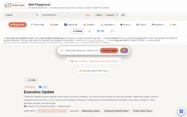
From the mohitagw15856/pm-claude-skills README — shows the whole collection, not only this skill. · view on GitHub
How to use it
Claude Code
- Run the line below. It pulls the whole folder into
~/.claude/skills/design-critique. - Describe your job in plain words. Claude Code follows the skill from there.
npx degit mohitagw15856/pm-claude-skills/skills/design-critique#main ~/.claude/skills/design-critiqueFor one project only, change the path to .claude/skills/design-critique.
Claude (web or desktop app)
- On this page open ⋯ → Download .md.
- Save it as SKILL.md in a folder, zip the folder, then Customize → Skills → + → Create skill → Upload a skill.
- Pick the file and Save. Claude shows the name and description and runs a security scan.
- Check the skill is switched on.
- Start a new chat and describe your job in plain words. The AI follows the skill from there.
ChatGPT or another app
- ChatGPT: make a Project and paste it into Instructions.
- Neither? Paste it at the top of a new chat — it works for that chat.
Not working?
- Check which app you pasted it into — the steps above name the right one.
- Some skills need the paid tier of Claude or ChatGPT.
Paste into Claude, ChatGPT or Cursor.
Source of Design Critique Skill
Show the full text139 lines
| name | description |
|---|---|
| design-critique | Give structured, constructive feedback on any design using UX frameworks. Use when asked to critique a design, review a UI, give feedback on a Figma file or wireframe, assess a user flow, or evaluate a design against UX principles. Produces actionable critique applying Jobs-to-be-Done, Gestalt principles, and usability heuristics, with prioritised issues and specific recommendations. |
Design Critique Skill
This skill provides structured, actionable design feedback using established UX frameworks. It balances positive observations with clear, prioritised improvement suggestions.
Required Inputs
Ask the user for these if not provided:
- What is being reviewed (screen, flow, component, full product)
- Design description or attached image (describe it if no image — the skill will still work)
- User goal (what is the user trying to accomplish with this design?)
- Context (web / mobile / desktop app / physical product)
- Stage (early wireframe / mid-fidelity / high-fidelity / live product)
- Primary concern (optional — e.g. "I'm worried the onboarding is too long" or "I think the CTA is unclear")
Output Structure
Design Critique: [Design Name or Screen]
User goal: [What the user needs to accomplish] Context: [Platform / Stage] Critique focus: [Primary concern if stated, otherwise "full review"]
1. What's Working
[3–5 specific, honest observations about what the design does well. Don't manufacture praise — only include genuine strengths. Be specific: "The visual hierarchy clearly guides the eye from headline → supporting detail → CTA" is useful. "Looks clean" is not.]
2. Priority Issues
Rank issues by impact on the user goal. Use:
- 🔴 High — Blocks or significantly degrades the user's ability to complete their goal
- 🟡 Medium — Causes friction or confusion but doesn't block completion
- 🟢 Low — Polish or preference — nice to fix but not critical
For each issue:
[Priority] Issue [N]: [Short name]
What's happening: [Describe the specific design problem — be precise about which element, screen, or interaction]
Why it matters: [Connect to the user goal or a specific principle — don't just say "it's confusing." Say why it creates confusion and what the consequence is for the user.]
Framework reference: [Name the principle being violated — e.g. Nielsen's Heuristic #6 (Recognition over Recall), Gestalt proximity, JTBD clarity, Fitts's Law, etc.]
Recommendation: [Specific, actionable suggestion. Not "make the button bigger" but "Increase the primary CTA to at least 44x44px to meet touch target guidelines; consider moving it below the form rather than inline with the input fields to reduce accidental taps."]
3. Heuristic Assessment
Quick assessment against Nielsen's 10 Usability Heuristics — score each as ✅ Pass / 🟡 Partial / ❌ Fail:
| Heuristic | Status | Note |
|---|---|---|
| 1. Visibility of system status | ||
| 2. Match between system and real world | ||
| 3. User control and freedom | ||
| 4. Consistency and standards | ||
| 5. Error prevention | ||
| 6. Recognition rather than recall | ||
| 7. Flexibility and efficiency of use | ||
| 8. Aesthetic and minimalist design | ||
| 9. Help users recognise, diagnose, and recover from errors | ||
| 10. Help and documentation |
Only include heuristics relevant to what's visible in the design — don't penalise for things not in scope.
4. Gestalt Principles Check
[Comment on any Gestalt principles that are either well-applied or violated:]
- Proximity: [Are related elements grouped clearly?]
- Similarity: [Do similar elements look similar?]
- Continuity: [Does the eye flow naturally through the design?]
- Figure/Ground: [Is the primary content clearly distinguished from background?]
- Closure: [Are any implied shapes or containers confusing?]
5. JTBD Alignment
[Assess how well the design serves the stated job-to-be-done:]
- Does the design make the user's primary job obvious? [Yes / Partially / No — explain]
- Are there any elements that distract from the primary job? [List any competing CTAs, distractions, or unclear hierarchy]
- What emotional job does this design serve? [Speed / Confidence / Control / Delight / Other] — and does the visual design match that emotional goal?
6. Top 3 Recommended Next Steps
Prioritised list of the 3 most impactful changes. Each should be actionable in the next design iteration:
- [Most impactful change — specific]
- [Second priority]
- [Third priority]
Quality Checks
- "What's working" includes only genuine, specific observations
- Every issue has a framework reference (not just subjective opinion)
- Recommendations are specific and actionable
- Priority levels (High/Medium/Low) reflect actual impact on user goal
- Heuristic assessment only covers visible elements
Anti-Patterns
- Do not lead with visual preference (e.g. "I don't like the colour") — every issue must reference a UX principle or user impact
- Do not invent problems in the "What's Working" section — manufactured praise undermines the entire critique
- Do not provide the same priority level (High/Medium/Low) to every issue — prioritisation requires genuine judgment about user impact
- Do not skip the JTBD section for product screens — connecting feedback to the user's job-to-be-done is what separates UX critique from aesthetic opinion
- Do not give recommendations that require a full redesign when the user is in high-fidelity — scope recommendations to the design stage
Example Trigger Phrases
- "Critique this design: [description or image]"
- "Give me feedback on this UI/UX"
- "Review this Figma screen for usability issues"
- "What's wrong with this user flow?"
- "Do a heuristic evaluation of [screen/product]"
| 1 | |
| 2 | name design-critique |
| 3 | description "Give structured, constructive feedback on any design using UX frameworks. Use when asked to critique a design, review a UI, give feedback on a Figma file or wireframe, assess a user flow, or evaluate a design against UX principles. Produces actionable critique applying Jobs-to-be-Done, Gestalt principles, and usability heuristics, with prioritised issues and specific recommendations." |
| 4 | |
| 5 | |
| 6 | # Design Critique Skill |
| 7 | |
| 8 | This skill provides structured, actionable design feedback using established UX frameworks. It balances positive observations with clear, prioritised improvement suggestions. |
| 9 | |
| 10 | ## Required Inputs |
| 11 | |
| 12 | Ask the user for these if not provided: |
| 13 | **What is being reviewed** (screen, flow, component, full product) |
| 14 | **Design description or attached image** (describe it if no image — the skill will still work) |
| 15 | **User goal** (what is the user trying to accomplish with this design?) |
| 16 | **Context** (web / mobile / desktop app / physical product) |
| 17 | **Stage** (early wireframe / mid-fidelity / high-fidelity / live product) |
| 18 | **Primary concern** (optional — e.g. "I'm worried the onboarding is too long" or "I think the CTA is unclear") |
| 19 | |
| 20 | ## Output Structure |
| 21 | |
| 22 | |
| 23 | |
| 24 | # Design Critique: [Design Name or Screen] |
| 25 | |
| 26 | **User goal:** [What the user needs to accomplish] |
| 27 | **Context:** [Platform / Stage] |
| 28 | **Critique focus:** [Primary concern if stated, otherwise "full review"] |
| 29 | |
| 30 | |
| 31 | |
| 32 | ## 1. What's Working |
| 33 | |
| 34 | [3–5 specific, honest observations about what the design does well. Don't manufacture praise — only include genuine strengths. Be specific: "The visual hierarchy clearly guides the eye from headline → supporting detail → CTA" is useful. "Looks clean" is not.] |
| 35 | |
| 36 | |
| 37 | |
| 38 | ## 2. Priority Issues |
| 39 | |
| 40 | Rank issues by impact on the user goal. Use: |
| 41 | 🔴 **High** — Blocks or significantly degrades the user's ability to complete their goal |
| 42 | 🟡 **Medium** — Causes friction or confusion but doesn't block completion |
| 43 | 🟢 **Low** — Polish or preference — nice to fix but not critical |
| 44 | |
| 45 | For each issue: |
| 46 | |
| 47 | ### [Priority] Issue [N]: [Short name] |
| 48 | |
| 49 | **What's happening:** |
| 50 | [Describe the specific design problem — be precise about which element, screen, or interaction] |
| 51 | |
| 52 | **Why it matters:** |
| 53 | [Connect to the user goal or a specific principle — don't just say "it's confusing." Say why it creates confusion and what the consequence is for the user.] |
| 54 | |
| 55 | **Framework reference:** |
| 56 | [Name the principle being violated — e.g. Nielsen's Heuristic #6 (Recognition over Recall), Gestalt proximity, JTBD clarity, Fitts's Law, etc.] |
| 57 | |
| 58 | **Recommendation:** |
| 59 | [Specific, actionable suggestion. Not "make the button bigger" but "Increase the primary CTA to at least 44x44px to meet touch target guidelines; consider moving it below the form rather than inline with the input fields to reduce accidental taps."] |
| 60 | |
| 61 | |
| 62 | |
| 63 | ## 3. Heuristic Assessment |
| 64 | |
| 65 | Quick assessment against Nielsen's 10 Usability Heuristics — score each as ✅ Pass / 🟡 Partial / ❌ Fail: |
| 66 | |
| 67 | | Heuristic | Status | Note | |
| 68 | |---|---|---| |
| 69 | | 1. Visibility of system status | | | |
| 70 | | 2. Match between system and real world | | | |
| 71 | | 3. User control and freedom | | | |
| 72 | | 4. Consistency and standards | | | |
| 73 | | 5. Error prevention | | | |
| 74 | | 6. Recognition rather than recall | | | |
| 75 | | 7. Flexibility and efficiency of use | | | |
| 76 | | 8. Aesthetic and minimalist design | | | |
| 77 | | 9. Help users recognise, diagnose, and recover from errors | | | |
| 78 | | 10. Help and documentation | | | |
| 79 | |
| 80 | Only include heuristics relevant to what's visible in the design — don't penalise for things not in scope. |
| 81 | |
| 82 | |
| 83 | |
| 84 | ## 4. Gestalt Principles Check |
| 85 | |
| 86 | [Comment on any Gestalt principles that are either well-applied or violated:] |
| 87 | |
| 88 | **Proximity:** [Are related elements grouped clearly?] |
| 89 | **Similarity:** [Do similar elements look similar?] |
| 90 | **Continuity:** [Does the eye flow naturally through the design?] |
| 91 | **Figure/Ground:** [Is the primary content clearly distinguished from background?] |
| 92 | **Closure:** [Are any implied shapes or containers confusing?] |
| 93 | |
| 94 | |
| 95 | |
| 96 | ## 5. JTBD Alignment |
| 97 | |
| 98 | [Assess how well the design serves the stated job-to-be-done:] |
| 99 | |
| 100 | **Does the design make the user's primary job obvious?** [Yes / Partially / No — explain] |
| 101 | **Are there any elements that distract from the primary job?** [List any competing CTAs, distractions, or unclear hierarchy] |
| 102 | **What emotional job does this design serve?** [Speed / Confidence / Control / Delight / Other] — and does the visual design match that emotional goal? |
| 103 | |
| 104 | |
| 105 | |
| 106 | ## 6. Top 3 Recommended Next Steps |
| 107 | |
| 108 | Prioritised list of the 3 most impactful changes. Each should be actionable in the next design iteration: |
| 109 | |
| 110 | [Most impactful change — specific] |
| 111 | [Second priority] |
| 112 | [Third priority] |
| 113 | |
| 114 | |
| 115 | |
| 116 | ## Quality Checks |
| 117 | |
| 118 | [ ] "What's working" includes only genuine, specific observations |
| 119 | [ ] Every issue has a framework reference (not just subjective opinion) |
| 120 | [ ] Recommendations are specific and actionable |
| 121 | [ ] Priority levels (High/Medium/Low) reflect actual impact on user goal |
| 122 | [ ] Heuristic assessment only covers visible elements |
| 123 | |
| 124 | ## Anti-Patterns |
| 125 | |
| 126 | [ ] Do not lead with visual preference (e.g. "I don't like the colour") — every issue must reference a UX principle or user impact |
| 127 | [ ] Do not invent problems in the "What's Working" section — manufactured praise undermines the entire critique |
| 128 | [ ] Do not provide the same priority level (High/Medium/Low) to every issue — prioritisation requires genuine judgment about user impact |
| 129 | [ ] Do not skip the JTBD section for product screens — connecting feedback to the user's job-to-be-done is what separates UX critique from aesthetic opinion |
| 130 | [ ] Do not give recommendations that require a full redesign when the user is in high-fidelity — scope recommendations to the design stage |
| 131 | |
| 132 | ## Example Trigger Phrases |
| 133 | |
| 134 | "Critique this design: [description or image]" |
| 135 | "Give me feedback on this UI/UX" |
| 136 | "Review this Figma screen for usability issues" |
| 137 | "What's wrong with this user flow?" |
| 138 | "Do a heuristic evaluation of [screen/product]" |
| 139 |
Discussion
Browse more free Claude skills or everything in Design.