Border Gradients
Apply subtle gradient-border treatments for premium web surfaces.
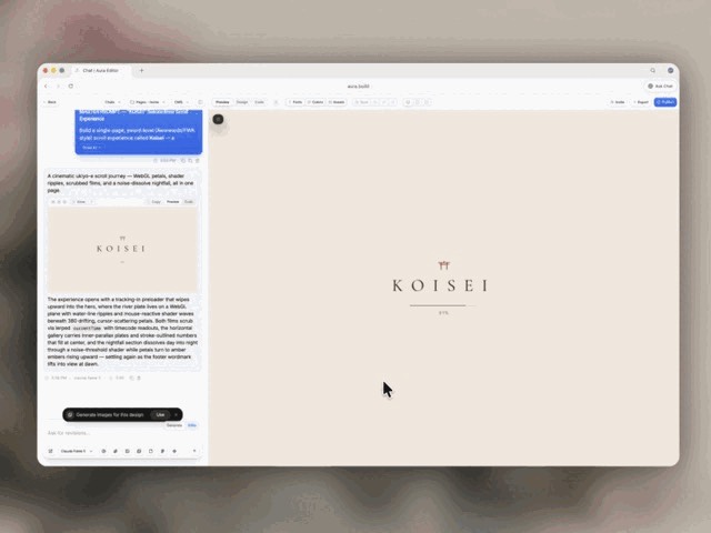
From the MengTo/Skills README — shows the whole collection, not only this skill. · view on GitHub
How to use it
Claude Code
- Run the line below. It pulls the whole folder into
~/.claude/skills/css-border-gradient. - Describe your job in plain words. Claude Code follows the skill from there.
Claude Code — installs the whole folder, not just SKILL.md
npx degit MengTo/Skills/agent-skills/web-design/css-border-gradient#main ~/.claude/skills/css-border-gradientFor one project only, change the path to .claude/skills/css-border-gradient.
Claude (web or desktop app)
- On this page open ⋯ → Download .md.
- Save it as SKILL.md in a folder, zip the folder, then Customize → Skills → + → Create skill → Upload a skill.
- Pick the file and Save. Claude shows the name and description and runs a security scan.
- Check the skill is switched on.
- Start a new chat and describe your job in plain words. The AI follows the skill from there.
ChatGPT or another app
- ChatGPT: make a Project and paste it into Instructions.
- Neither? Paste it at the top of a new chat — it works for that chat.
Not working?
- Check which app you pasted it into — the steps above name the right one.
- Some skills need the paid tier of Claude or ChatGPT.
Paste into Claude, ChatGPT or Cursor.
Source of Border Gradients
Show the full text95 lines
| name | description |
|---|---|
| css-border-gradient | Apply subtle gradient-border treatments for premium web surfaces. Use when cards, pricing panels, nav bars, modals, buttons, or hero surfaces need a refined edge highlight without a loud glow. |
Border Gradients
Use When
- A surface needs a more premium edge than a flat
border. - Dark glass, pricing, hero, modal, or feature-card UI feels too plain.
- A hover or focus state needs a quiet brand accent.
Defaults
- Width:
1px; use2pxonly for large hero cards or active states. - Radius: inherit the parent radius.
- Angle:
135degor160deg. - Stops: neutral highlight, one brand accent, neutral fade.
- Opacity: keep most stops below
0.4; subtle beats shiny.
Simple CSS Pattern
Use this when the surface has a solid or translucent fill.
.gradient-border {
  --surface: rgba(10, 14, 24, 0.72);
  --border-a: rgba(255, 255, 255, 0.34);
  --border-b: rgba(125, 92, 255, 0.36);
  --border-c: rgba(255, 255, 255, 0.08);

  border: 1px solid transparent;
  border-radius: 20px;
  background:
    linear-gradient(var(--surface), var(--surface)) padding-box,
    linear-gradient(135deg, var(--border-a), var(--border-b), var(--border-c)) border-box;
}
<div class="gradient-border">
  ...
</div>
Masked Pattern
Use this when the surface already has a complex background that should not be overwritten.
.gradient-border-mask {
  position: relative;
  border-radius: 20px;
}

.gradient-border-mask::before {
  content: "";
  position: absolute;
  inset: 0;
  border-radius: inherit;
  padding: 1px;
  background: linear-gradient(
    145deg,
    rgba(255, 255, 255, 0.34),
    rgba(125, 92, 255, 0.36) 45%,
    rgba(255, 255, 255, 0.08)
  );
  -webkit-mask:
    linear-gradient(#fff 0 0) content-box,
    linear-gradient(#fff 0 0);
  -webkit-mask-composite: xor;
  mask-composite: exclude;
  pointer-events: none;
}
Tailwind Shortcut
Use arbitrary properties for one-off surfaces.
<div class="rounded-2xl border border-transparent [background:linear-gradient(rgba(10,14,24,.72),rgba(10,14,24,.72))_padding-box,linear-gradient(135deg,rgba(255,255,255,.34),rgba(125,92,255,.36),rgba(255,255,255,.08))_border-box]">
  ...
</div>
Taste Rules
- Apply to one hierarchy level at a time: primary card, active tab, selected plan, or hero panel.
- Do not use rainbow borders, full-saturation neon, or animated gradients by default.
- Keep the border quieter than the content. It should frame, not compete.
- Pair with restrained depth: a soft shadow or inner highlight is enough.
- Check light and dark themes separately; the same alpha rarely works for both.
Quick Checks
- No double border from an existing
border-color. - Radius matches the surface exactly.
- The gradient is visible at normal zoom but barely noticeable when scanning.
- Focus states remain accessible and do not rely only on the gradient.
| 1 | |
| 2 | name css-border-gradient |
| 3 | description Apply subtle gradient-border treatments for premium web surfaces. Use when cards, pricing panels, nav bars, modals, buttons, or hero surfaces need a refined edge highlight without a loud glow. |
| 4 | |
| 5 | |
| 6 | # Border Gradients |
| 7 | |
| 8 | ## Use When |
| 9 | A surface needs a more premium edge than a flat `border`. |
| 10 | Dark glass, pricing, hero, modal, or feature-card UI feels too plain. |
| 11 | A hover or focus state needs a quiet brand accent. |
| 12 | |
| 13 | ## Defaults |
| 14 | Width: `1px`; use `2px` only for large hero cards or active states. |
| 15 | Radius: inherit the parent radius. |
| 16 | Angle: `135deg` or `160deg`. |
| 17 | Stops: neutral highlight, one brand accent, neutral fade. |
| 18 | Opacity: keep most stops below `0.4`; subtle beats shiny. |
| 19 | |
| 20 | ## Simple CSS Pattern |
| 21 | Use this when the surface has a solid or translucent fill. |
| 22 | |
| 23 | |
| 24 | .gradient-border { |
| 25 | --surface: rgba(10, 14, 24, 0.72); |
| 26 | --border-a: rgba(255, 255, 255, 0.34); |
| 27 | --border-b: rgba(125, 92, 255, 0.36); |
| 28 | --border-c: rgba(255, 255, 255, 0.08); |
| 29 | |
| 30 | border: 1px solid transparent; |
| 31 | border-radius: 20px; |
| 32 | background: |
| 33 | linear-gradient(var(--surface), var(--surface)) padding-box, |
| 34 | linear-gradient(135deg, var(--border-a), var(--border-b), var(--border-c)) border-box; |
| 35 | } |
| 36 | |
| 37 | |
| 38 | |
| 39 | <div class="gradient-border"> |
| 40 | ... |
| 41 | </div> |
| 42 | |
| 43 | |
| 44 | ## Masked Pattern |
| 45 | Use this when the surface already has a complex background that should not be overwritten. |
| 46 | |
| 47 | |
| 48 | .gradient-border-mask { |
| 49 | position: relative; |
| 50 | border-radius: 20px; |
| 51 | } |
| 52 | |
| 53 | .gradient-border-mask::before { |
| 54 | content: ""; |
| 55 | position: absolute; |
| 56 | inset: 0; |
| 57 | border-radius: inherit; |
| 58 | padding: 1px; |
| 59 | background: linear-gradient( |
| 60 | 145deg, |
| 61 | rgba(255, 255, 255, 0.34), |
| 62 | rgba(125, 92, 255, 0.36) 45%, |
| 63 | rgba(255, 255, 255, 0.08) |
| 64 | ); |
| 65 | -webkit-mask: |
| 66 | linear-gradient(#fff 0 0) content-box, |
| 67 | linear-gradient(#fff 0 0); |
| 68 | -webkit-mask-composite: xor; |
| 69 | mask-composite: exclude; |
| 70 | pointer-events: none; |
| 71 | } |
| 72 | |
| 73 | |
| 74 | ## Tailwind Shortcut |
| 75 | Use arbitrary properties for one-off surfaces. |
| 76 | |
| 77 | |
| 78 | <div class="rounded-2xl border border-transparent [background:linear-gradient(rgba(10,14,24,.72),rgba(10,14,24,.72))_padding-box,linear-gradient(135deg,rgba(255,255,255,.34),rgba(125,92,255,.36),rgba(255,255,255,.08))_border-box]"> |
| 79 | ... |
| 80 | </div> |
| 81 | |
| 82 | |
| 83 | ## Taste Rules |
| 84 | Apply to one hierarchy level at a time: primary card, active tab, selected plan, or hero panel. |
| 85 | Do not use rainbow borders, full-saturation neon, or animated gradients by default. |
| 86 | Keep the border quieter than the content. It should frame, not compete. |
| 87 | Pair with restrained depth: a soft shadow or inner highlight is enough. |
| 88 | Check light and dark themes separately; the same alpha rarely works for both. |
| 89 | |
| 90 | ## Quick Checks |
| 91 | No double border from an existing `border-color`. |
| 92 | Radius matches the surface exactly. |
| 93 | The gradient is visible at normal zoom but barely noticeable when scanning. |
| 94 | Focus states remain accessible and do not rely only on the gradient. |
| 95 |
Discussion
Browse more free Claude skills.