Studio Grade: design like the studios that win skill
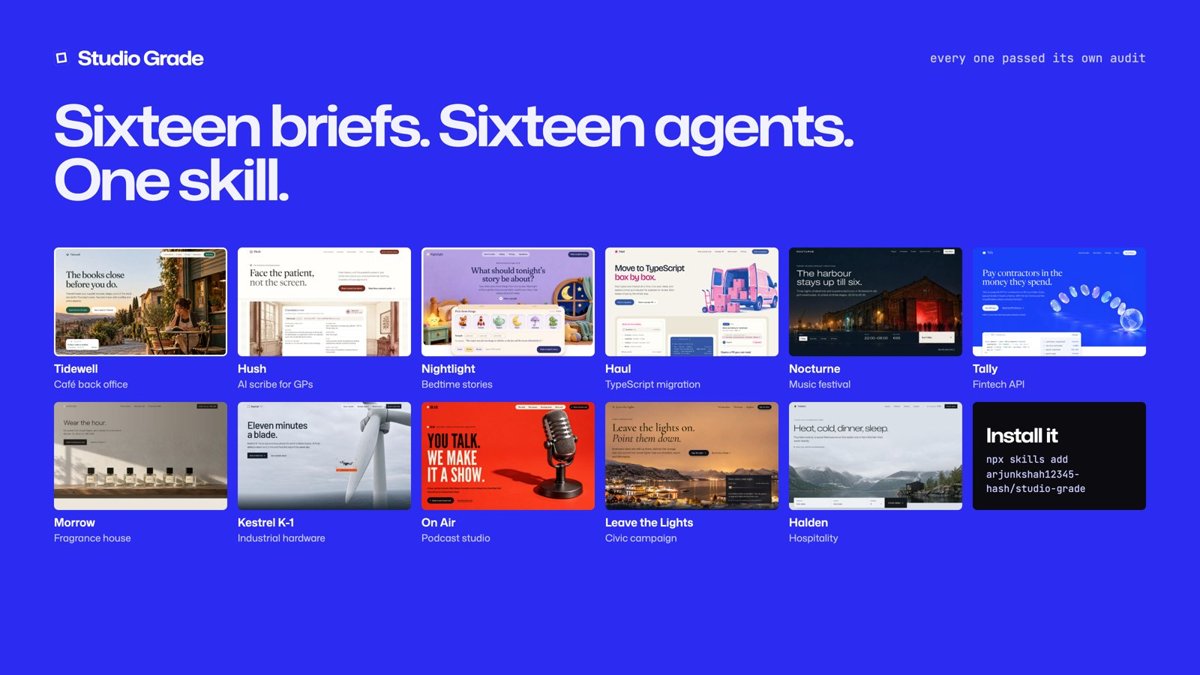
Illustration · not a resultFrom the arjunkshah12345-hash/studio-grade README — shows the whole collection, not only this skill.source ↗
Agency-grade web design for websites, landing pages, marketing sites, product launches, portfolios, e-commerce, and redesigns.
by arjunkshah12345-hash·MIT license·★ 4 Stars on the repo·GitHub ↗
npx degit arjunkshah12345-hash/studio-grade/studio-grade#main ~/.claude/skills/studio-gradeChecked ·commit main
Files of Studio Grade: design like the studios that win
Show the full text209 lines
Studio Grade: design like the studios that win
This skill comes from measuring live client work, not from taste. We loaded 99 sites in headless Chrome at 1440px and 390px, read their computed styles and mined their JS bundles for motion values. The sites were shipped by about 40 studios (the evidence list is in references/evidence.md). Every number below is a measured range from real sites. When this file says "64px", it means the median of Linear, Vercel, Ramp, and Raycast, not a guess.
The finding behind all of it: top-tier work is disciplined in a very specific, measurable way. AI-generated work is noisy in a very specific, measurable way. Discipline is about count (one idea, one type system, one colour logic), not volume. Some of the best sites studied are quiet (Totême, Aesop); some are loud (Lando Norris, MindMarket, Norton, Obama). This skill teaches discipline at every volume and bans noise.
Warning about medians. The measured defaults below are medians, and medians produce the average site. Applied without choosing a register and the five range axes (references/range.md), every build converges on the same tasteful look (off-white paper, mono labels, hairline metadata, a line-drawing hero). That look is not a direction; it is a default. Step 1 makes you choose.
The six laws (what separates the top tier from templates)
- Discipline is the signal. Use 1–2 typefaces (3 max), 2 weights, and one colour logic. In the quiet register that means one accent at under 5% of pixels (Factory's orange is on 3 text nodes; Totême has none). In the loud register it means colour as a full-bleed field, with each hue assigned one meaning (Norton gives each section a colour; MindMarket's whole hero is lime). What reads as cheap is many unrelated colours, not a lot of one.
- Type does the work. Hierarchy comes from size, tracking, and opacity, not weight. Display type sits at weight 300–500 with negative tracking (−0.02 to −0.06em) and line-height 0.85–1.05. Secondary text uses the same ink at lower opacity (100 / 60 / 40%), not a new grey.
- The image is the subject, never decoration. Use the real product UI rebuilt in HTML, an art-directed photograph, an illustration cast, a colour-block composition, a type poster, a tactile object, a collage, or a domain-specific drawing. Choose the medium that fits the brand (range.md §2C); don't reach for a thin line drawing by habit. Never gradient blobs, glowing orbs, stock 3D shapes, or icon-in-a-rounded-square grids.
- One idea, carried everywhere. Serve Robotics reuses the robot's two "eyes" as loader, glow, icon, and scroll mascot. Kriss.ai uses corner brackets on buttons, nav, and cards. Pick one motif and use it 3–5 times, changing its role and scale each time (hero ornament → divider → loader → icon → data-viz). The same texture used as background filler in every section is wallpaper, not a motif. The strongest motifs count: one coin per contractor, one dot per stage (techniques.md §83).
- Motion focuses; it does not perform. Text is still: 3 in 4 top sites show the hero heading on the first frame, and 4 in 5 leave body copy in place (motion.md §0). Motion goes to media, card groups, the product and interaction. Elements resolve (blur → sharp, grey → ink) more than they fly. Use one house ease (expo-out), 150–300ms for UI and 600–1000ms for reveals. Overshoot is only for tiny UI pops.
- Craft lives in the boring places, and the copy has a voice. Examples: a cookie banner set in the display face, a live clock in the footer, read-time labels, footnoted claims, optically corrected button padding. Headlines run 2–8 words and are declarative, specific, and never hype.
Workflow (follow in order)
Step 1: Pick ONE direction, a register, and the five range axes
Read the brief. Pick one direction from this table (the system), then a register: Quiet, Confident or Loud (the volume). Then choose the five range axes: ground, type genre, image medium, composition, motion feel. All of these are in references/range.md. Read it every time; it exists because skipping it makes every site look the same. Full recipes (tokens, fonts, hero, sections, motion, signature moves) are in references/directions.md. Read the chosen direction's section before writing any code.
| # | Direction | Use for | Studied exemplars |
|---|---|---|---|
| 1 | Engineered Dark | dev tools, AI products, power-user apps, indie utilities | Linear, Raycast, Resend, Black Forest Labs, convt |
| 2 | Ledger Light | B2B SaaS, fintech, infra, docs, APIs | Stripe, Vercel, Mintlify, Attio, Factory, Baseten, Ramp |
| 3 | Warm Paper | AI labs, thoughtful tools, founder-led products, personal sites, hardware with a mission | Anthropic, Cursor, Daylight, Steve Jobs Archive, jawadjalal.com |
| 4 | Editorial Motion | studios, architecture, portfolios, culture, premium services | Studio D (Exo Ape), Populous (Locomotive), Bennett & Clive, Atlas Motion |
| 5 | Quiet Luxury Commerce | fashion, beauty, fragrance, objects, D2C premium | Aesop, Totême, Magda Butrym, Aman, Akris |
| 6 | Cinematic Place | hospitality, travel, real estate, wine, experiences | White Desert (Malvah), ERA Residence, Tengile, Ace Hotel |
| 7 | Institutional | museums, nonprofits, publishers, foundations, government, large content | Art Institute of Chicago, Obama Foundation, Pentagram, Norton |
| 8 | Deep-Tech Spec | robotics, aerospace, climate, biotech, hardware, industrial AI | Terminal Industries, ICOMAT, Inversa, Glyphic, Vast, Radian |
| 9 | Playful System | consumer apps, games, community, studios and B2B that want warmth | Family, MindMarket, Lando Norris, Choo-Choo World, Ignura |
| 10 | Immersive | launches with one hero object, campaigns, cause pieces, dwell-time KPIs | illoca (Unseen), Lusion, Immersive Garden, Active Theory |
| 11 | Bright Product | AI tools, SaaS and consumer apps that should feel friendly and finished; needs an image system (generated series) | Fornax, Answerr, Mugic, Wandor, BugScout (user-supplied screenshots) |
How to choose:
- Users who must scan, compare, or convert (pricing, docs, catalogs, SaaS) → 1, 2, 5, or 7. Native scroll, no preloader.
- Users who come to feel something (brand, place, launch, portfolio) → 4, 6, 8, or 10. Smooth scroll, a designed intro, and long pages are allowed.
- If the user names a reference site, match its direction and its register. If two directions fit, pick the one whose exemplars the audience would recognise, and borrow one signature move from the other.
- Register by audience: consumers, youth, culture, sport, civic causes, festivals and food lean Confident or Loud. Luxury, institutions, finance and developer tools lean Quiet or Confident. When in doubt, choose Confident: one bold device at scale, the rest disciplined.
- Building several sites in one project or session (variants, a portfolio, a gallery)? No two may share more than 2 of the 5 axis values (range.md §3).
- For a redesign, run the audit (Step 6) on the existing page first, then keep what is genuinely good.
Step 2: Write the Design Spine before any code
Write this block in your reply or in a comment at the top of the main file (a comment above <!doctype html> is safe: it doesn't trigger quirks mode, and the audit reads it from there). Each line must be concrete. "Modern and clean" is not a spine.
DIRECTION   : <one of the 10> — why it fits the audience in one sentence
REGISTER    : Quiet | Confident | Loud — and the one bold device, if Confident/Loud
AXES        : ground <off-white | white | tinted dark | mid-tone | saturated field | colour blocks> · type genre <…> · image medium <…> · composition <…> · motion feel <…>
DEFAULT?    : default-look check (range.md §3): <n>/6 matched → DIFFERENT FROM DEFAULT BY: <axes changed>
MOTIF       : <the one idea, used 3–5×; list each use and its role>
TYPE        : display <family weight> · text <family> · mono/label <family>  (≤3 families)
SCALE       : display <px>/<lh>/<tracking em> · h2 · body · label   (scale in assets/tokens.css; tracking and leading tables in references/typography.md)
PALETTE     : paper <hex> · ink <hex> · ink-2 (ink @60%) · hairline (ink @8–12%) · accent <hex> → used ONLY on <1–2 jobs>
GRID        : <cols>/<gap> · container <px> · side margin <px> · section rhythm <px>
HERO        : <archetype from references/layout.md> — what the first viewport shows
IMAGERY     : <medium from range.md §2C: product UI / photo / illustration cast / colour blocks / type poster / object / collage / data / line drawing>
CONVERSION  : <the primary action and every place it appears>
MOTION      : house ease <cubic-bezier> · UI <ms> · reveal <ms> · primitive <blur-in / ink-in / mask>
IMAGES      : the style bible if you generate images (medium · palette hexes · light · viewpoint · type zone · exclusions · shot list), imagery.md §8; or "none: <the medium instead>"
NAMING      : <the brand metaphor> → tiers · steps · CTA verb · 404 line   (techniques.md §63; omit if the brand has no metaphor)
SIGNATURES  : 2–3 named moves from references/techniques.md (no more; system rules §63/§66/§67 don't count)
VOICE       : 3 sample lines (hero, section, CTA) in the brand's voice
Step 3: Tokens first
Start from assets/tokens.css. It defines the fluid type scale, text-style bundles, spacing ladder, grid, eases, durations, hairlines, focus, and reduced motion. Override its variables with the Spine values. Every size, color, radius, ease, and duration in the page must come from a token. Following AREA 17's practice, each text style is a bundle (family + size + line-height + tracking + weight + features), not a loose font-size.
Load real fonts (see the substitution table in references/typography.md). Never ship the system-font fallback as the design.
Setup that every build needs:
- Put
<script>document.documentElement.classList.add('js')</script>in<head>. Reveal states only hide content when that class is present, so a failed script never leaves a blank page. assets/motion.jsis an ES module: serve the build over HTTP (any static server), notfile://.- Token exemptions: values inside product-UI replicas and generated SVG (viewBox units, fake-UI sizes) don't need tokens. Mark replicas
role="img"with anaria-label. - The accent isn't spent anywhere by default. Assign it to its 1–2 jobs yourself (
--eyebrow-dot,--focus, buttons).
Step 4: Compose sections; do not fill a template
Use the direction's page anatomy (references/directions.md) and section patterns (references/layout.md). Rules that hold on every studied site:
- The hero shows one statement and one subject: an h1 of 2–8 words, a subline of 2 lines or fewer, at most 2 CTAs (primary solid + ghost/text; a persistent nav CTA doesn't count), and the subject (product, object, photo, or demo). Hero copy and CTAs are visible from the first frame: reveal the subject, not the button.
- After the hero, break symmetry. Use left-aligned or asymmetric sections, sticky columns, media that bleeds off the viewport edge, and alternating density. Never stack 8 centered sections of equal height.
- Features are chapters, not icon cards. Each chapter is a heading (a two-tone sentence) plus real media plus a short list. Numbered
01 / 02 / 03typographic blocks are fine. Three icon-title-text cards are not. - End with a confident one-line finale ("Built for the future. Available today.", "Take the short way.") followed by a real 4–6 column footer.
- Operational truth is content. Hours, stock status, pricing, install commands, and live numbers get first-class type.
Step 5: Craft pass
Work through references/components.md and the checklist below. This pass is the difference between "good" and "studio".
- Display tracking scales with size: −0.04 to −0.06em at 100px+, −0.02em at 48px, about 0 at body size, +0.04 to +0.12em on ≤12px uppercase labels.
- Two-tone headings: the statement in ink, the elaboration in ink at 55–65%, at the same size and on the same line.
- Hairlines are 1px at 6–12% ink. Use
box-shadow: 0 0 0 1pxrings instead of borders where stacking matters. - Copy integrity: no section, heading or paragraph appears twice (audit
copy.integrity); headings are in sentence case (copy.case); the brand name, wordmark and every compliance acronym are spelled right (HIPAA, not HIPPA; WCAG 2.2 AA); no FAQ or subheading reuses another section's text. - Numbers that change or align in columns use
font-variant-numeric: tabular-nums(check punctuation: some grotesks widen,and:in tabular mode, so prices in running text may need proportional figures). Uppercase usesfont-feature-settings: "case". - Buttons follow one radius camp across the whole site (0–4px or pill), with heights of 36–52px and optical padding (1px less on the bottom).
- Every image has an aspect ratio, a defined crop, and alt text. Every autoplay video has a pause control.
- Mobile has its own composition (390px): a 32–44px h1, stacked full-width CTAs, and media cropped deliberately. It is not just the desktop layout shrunk.
- At least one bespoke detail in a boring place (footer, cookie banner, 404, form success, loader).
- Copy pass with
references/copy.md: no banned phrases, CTAs name the task, and headlines are 2–8 words. - No invented proof presented as real. With no real customers, stats or quotes, leave them out or mark them clearly as placeholders, and list them for the user.
-
prefers-reduced-motionturns reveals into simple opacity changes and disables smooth scroll and parallax.
Step 6: Audit, look, and fix (mandatory)
node <skill-dir>/scripts/audit.mjs <url-or-path-to-index.html> --out ./audit --direction <1-11> --register <quiet|confident|loud>
The script loads the page at 1440px and 390px. It measures the rules in this skill (font count, display tracking and leading, pure black/white, accent count, gradient text, emoji and hype copy, hero CTA count, icon-card grids, radius consistency, shadows, contrast, mobile overflow, tap targets, reduced-motion support, text drawn over other text while scrolling, and reveals that never finish) and saves screenshots, including one slice-NN.jpg per viewport down the whole page. Open every slice and look at it. In every test build, the screenshots caught more real bugs than the report did. Fix every FAIL and judge every WARN. Then re-run. The script needs Playwright: npm i -D playwright && npx playwright install chromium if it is missing.
The script cannot judge taste. After it passes, check the screenshots against the squint test (does one thing dominate each viewport?), the logo test (cover the logo: is it still identifiably this brand?), and the template test (could this hero belong to any other startup? If yes, the motif is too weak).
Measured defaults (Quiet/Confident register; Loud overrides them per range.md)
| Property | Measured norm | Source spread |
|---|---|---|
| Hero h1, sentence (SaaS) | 56–72px at 1440 (median 64) | 48 Stripe → 96 Resend |
| Hero h1, 1–3 words (editorial / brand) | 9–18vw (130–260px) | Studio D 128, Ayocin 240, White Desert 320 |
| Luxury commerce hero text | 18–31px | Totême 18, Aesop 31 |
| Display line-height | 0.85–1.05 (word heads 0.77–0.9) | never above 1.1 |
| Display tracking | −0.02 to −0.05em (sans) | 53/94 sites negative; serif and condensed faces sit near 0 |
| Display weight | 300–500 | 700+ appears on fewer than 10% of sites |
| h1 : h2 ratio (SaaS) | 1.15–1.6 | hierarchy comes from whitespace |
| Body | 15–18px marketing, 13–15px UI, 12–14px luxury | median 15 |
| Labels | 10–12px, uppercase, +0.04 to +0.12em, often mono | luxury kickers go up to +0.2em |
| Families | 2 (1 sans + 1 mono, or sans + serif) | max 3 |
| Page background | off-white #F5F3EF–#FAFAF8 or tinted near-black #08090A–#17190F |
pure #FFF on 25/67, but body text is never #000 |
| Body text | #171717–#333 on light, #EDEDF0–#F7F8F8 on dark |
never #000 on #FFF or #FFF on #000 |
| Accent | 1 hue, under 5% of pixels, 1–2 jobs | most often: primary CTA, index numerals, status dots |
| Hairline | 1px at 6–12% ink | 68 uses on Linear |
| Radius | buttons 0–8px or pill (one camp); cards 4–12px; media up to 16–28px | 4px is the most common |
| Container / margins | 1200–1312px content, or full-bleed with 24–48px margins | |
| Section rhythm | padding 96–144px, visual gaps 160–300px | |
| House ease | cubic-bezier(0.16,1,0.3,1) / (0.22,1,0.36,1) / (0.19,1,0.22,1) |
expo/quint-out on most sites |
| Durations | UI 120–300ms · reveal 600–1000ms · ambient loops 1.6–3.2s · marquees 40–120s | |
| Springs | UI {stiffness: 400–500, damping: 25–28} · heavy {mass: 4, stiffness: 800, damping: 80} |
|
| Page length | SaaS 9–10 viewports · luxury commerce 3–9 · editorial and award sites 12–23 |
Imagery when you have no photographs
Agents rarely have art-directed photos, which is the most common reason AI pages fall back to gradient blobs. The second most common failure is the opposite: every page falls back to a thin line drawing with mono labels. Pick the medium from the brand and register, not from this list's order (full menu in references/range.md §2C, recipes in references/imagery.md):
- The product, rebuilt in HTML/CSS. Use a realistic app window: a 240px sidebar, 13px UI text, live micro-states (an agent "Thinking…" shimmer, a card tilted 4° mid-drag, a typing caret). Dim secondary panes to 40%, let the window bleed off the hero bottom, and mask-fade the edges. This is Linear's, Attio's, Cursor's, and Ramp's main visual.
- Typography as the image. Try a monumental word, an object in front of a wordmark, a rotating noun, or a giant pale product name behind a small render.
- An illustration cast or a tactile object in SVG or CSS: characters with faces (Family, MindMarket), a chrome cube or clay toggles (Resend, Mercury), toy-plastic UI (Choo-Choo). This is right for consumer, playful, civic and warm brands.
- Colour fields and colour blocks as the image. Use full-bleed semantic colour bands (Norton, Fondation Cartier, Dropbox Brand) or a colour-bar composition (Seventeen), with text in a dark tint of the field's own hue.
- Domain-specific generative ornament in CSS, SVG or canvas: blueprint and crosshair grids, line drawings with mono labels, annotation boxes, dither, contour lines, glyph fields, spec tables. Pick one that is true to the domain. This is the right call for deep-tech and dev tools, and the overused one everywhere else.
- Real photos or video, if the user supplies them or you can generate them: treat them as cinematography (see the art direction rules in
references/imagery.md). Otherwise use clearly marked placeholders with an art-direction note (subject, light, crop, grade) instead of stock filler.
Hard bans (each one is a measured "never" across the top tier)
The full list, with the replacement for each item, is in references/anti-slop.md.
- Purple→blue or rainbow gradient blobs, AI glow orbs, and decorative glassmorphism cards.
- Gradient-filled headline text. Exception: one restrained, low-saturation gradient on product-hardware display (Apple), never neon.
- The SaaS template hero: badge, then centered 700-weight headline, then subhead, then two loud buttons, then a logo bar, then three icon cards.
- Display weight 700–900 by default; text-shadow; outlined or stroked display text.
- Many unrelated hues: rainbow feature icons, or more than one accent doing UI work in the Quiet register. (Loud is allowed: one colour logic, with each hue assigned to a meaning.)
- Emoji in headings or buttons; exclamation marks in headlines; hype verbs (Supercharge, Unleash, Revolutionize, Elevate, Empower, Unlock, Seamless, Next-gen, Cutting-edge, Game-changer).
- Pure
#000text on pure#FFF, or pure#FFFtext on#000. - Drop shadows on every card. Shadows belong only on floating product windows (long, soft, multi-layer).
- Large radii (24px+) on buttons and cards in non-playful directions. Mixing pill and square buttons.
- Bouncy or elastic easing on large surfaces; scroll-jacking on SaaS or commerce pages; generic spinners.
- Stock photos of people at laptops, generic 3D spheres, illustration packs.
- Centered-everything layouts below the hero.
Reference map (load only what the task needs)
| File | Read when |
|---|---|
references/directions.md |
Always, for the chosen direction: tokens, fonts, hero, section anatomy, motion, signatures |
references/range.md |
Always: register (quiet/confident/loud), the five range axes, the default-look check, loud recipes |
references/typography.md |
Choosing fonts (with free substitutes for premium faces), tracking tables, pairing rules |
references/color.md |
Building the palette; 20+ measured palettes with hex values; dark mode; accent discipline |
references/layout.md |
Grids, margins, hero archetypes, section-pattern library, page rhythm, mobile, studio and service sites that convert (§9) |
references/motion.md |
Eases, durations, springs, reveal primitives, loaders, smooth-scroll policy, reduced motion |
references/components.md |
Buttons, nav forms, eyebrows, cards, logo walls, testimonials, stats, forms, footers |
references/techniques.md |
83 signature techniques with copy-paste code (rails, ticker, letter-roll, aperture…) |
references/imagery.md |
Product-UI-as-hero, generative ornament, photo art direction, placeholders |
references/copy.md |
Headline formulas, voice, CTA verbs, banned phrases, microcopy |
references/anti-slop.md |
The full list of AI tells, each with its fix; use it for redesign audits |
references/evidence.md |
Which studio built which site; aggregate measurements |
assets/tokens.css |
Starting point for every build |
assets/motion.js |
Dependency-free reveal, split-text, ticker, letter-roll, and scroll-spy helpers (reduced-motion aware) |
scripts/audit.mjs |
Step 6, run on every build |
scripts/images.py |
Generated image series: one paper per series, cut-outs from sprite sheets, sized WebP/JPG exports (imagery.md §8) |
Stack notes: plain HTML/CSS with assets/motion.js covers most directions. In React, use Framer Motion springs with the values above. GSAP + ScrollTrigger + Lenis is warranted only for directions 4, 6, 8, and 10. For WebGL, keep all headings in the DOM, bake the lighting, cap DPR at 1.5, and always ship a non-WebGL fallback.
| 1 | |
| 2 | name studio-grade |
| 3 | description Agency-grade web design for websites, landing pages, marketing sites, product launches, portfolios, e-commerce, and redesigns. Built from measured teardowns of 99 live sites shipped by top studios (basement.studio, Bakken & Bæck, Work & Co, AREA 17, Instrument, Exo Ape, Locomotive, Lusion, Immersive Garden, Unseen, Malvah, The First The Last, and others) plus in-house teams like Linear, Stripe, Vercel, and Apple. Use it whenever a frontend's visual quality matters, or when the user asks for something premium, agency-level, award-worthy, or "not AI-looking". It covers picking a direction, type, color, layout, imagery without photos, motion, copy, and a scripted self-audit. |
| 4 | license MIT |
| 5 | |
| 6 | |
| 7 | # Studio Grade: design like the studios that win |
| 8 | |
| 9 | This skill comes from measuring live client work, not from taste. We loaded 99 sites in headless Chrome at 1440px and 390px, read their computed styles and mined their JS bundles for motion values. The sites were shipped by about 40 studios (the evidence list is in `references/evidence.md`). Every number below is a measured range from real sites. When this file says "64px", it means the median of Linear, Vercel, Ramp, and Raycast, not a guess. |
| 10 | |
| 11 | The finding behind all of it: **top-tier work is *disciplined* in a very specific, measurable way. AI-generated work is *noisy* in a very specific, measurable way.** Discipline is about count (one idea, one type system, one colour logic), not volume. Some of the best sites studied are quiet (Totême, Aesop); some are loud (Lando Norris, MindMarket, Norton, Obama). This skill teaches discipline at every volume and bans noise. |
| 12 | |
| 13 | **Warning about medians.** The measured defaults below are medians, and medians produce the average site. Applied without choosing a register and the five range axes (`references/range.md`), every build converges on the same tasteful look (off-white paper, mono labels, hairline metadata, a line-drawing hero). That look is not a direction; it is a default. Step 1 makes you choose. |
| 14 | |
| 15 | |
| 16 | |
| 17 | ## The six laws (what separates the top tier from templates) |
| 18 | |
| 19 | **Discipline is the signal.** Use 1–2 typefaces (3 max), 2 weights, and **one colour logic**. In the quiet register that means one accent at under 5% of pixels (Factory's orange is on 3 text nodes; Totême has none). In the loud register it means colour as a full-bleed *field*, with each hue assigned one meaning (Norton gives each section a colour; MindMarket's whole hero is lime). What reads as cheap is **many unrelated colours**, not a lot of one. |
| 20 | **Type does the work.** Hierarchy comes from size, tracking, and opacity, not weight. Display type sits at **weight 300–500** with **negative tracking (−0.02 to −0.06em)** and **line-height 0.85–1.05**. Secondary text uses *the same ink at lower opacity* (100 / 60 / 40%), not a new grey. |
| 21 | **The image is the subject, never decoration.** Use the real product UI rebuilt in HTML, an art-directed photograph, an illustration cast, a colour-block composition, a type poster, a tactile object, a collage, or a domain-specific drawing. Choose the medium that fits the brand (range.md §2C); don't reach for a thin line drawing by habit. **Never** gradient blobs, glowing orbs, stock 3D shapes, or icon-in-a-rounded-square grids. |
| 22 | **One idea, carried everywhere.** Serve Robotics reuses the robot's two "eyes" as loader, glow, icon, and scroll mascot. Kriss.ai uses corner brackets on buttons, nav, and cards. Pick one motif and use it 3–5 times, **changing its role and scale each time** (hero ornament → divider → loader → icon → data-viz). The same texture used as background filler in every section is wallpaper, not a motif. The strongest motifs **count**: one coin per contractor, one dot per stage (techniques.md §83). |
| 23 | **Motion focuses; it does not perform.** Text is still: 3 in 4 top sites show the hero heading on the first frame, and 4 in 5 leave body copy in place (motion.md §0). Motion goes to media, card groups, the product and interaction. Elements *resolve* (blur → sharp, grey → ink) more than they fly. Use one house ease (expo-out), 150–300ms for UI and 600–1000ms for reveals. Overshoot is only for tiny UI pops. |
| 24 | **Craft lives in the boring places, and the copy has a voice.** Examples: a cookie banner set in the display face, a live clock in the footer, read-time labels, footnoted claims, optically corrected button padding. Headlines run 2–8 words and are declarative, specific, and never hype. |
| 25 | |
| 26 | |
| 27 | |
| 28 | ## Workflow (follow in order) |
| 29 | |
| 30 | ### Step 1: Pick ONE direction, a register, and the five range axes |
| 31 | |
| 32 | Read the brief. Pick one direction from this table (the *system*), then a **register**: Quiet, Confident or Loud (the *volume*). Then choose the **five range axes**: ground, type genre, image medium, composition, motion feel. All of these are in **`references/range.md`**. Read it every time; it exists because skipping it makes every site look the same. Full recipes (tokens, fonts, hero, sections, motion, signature moves) are in **`references/directions.md`**. Read the chosen direction's section before writing any code. |
| 33 | |
| 34 | | # | Direction | Use for | Studied exemplars | |
| 35 | |---|---|---|---| |
| 36 | | 1 | **Engineered Dark** | dev tools, AI products, power-user apps, indie utilities | Linear, Raycast, Resend, Black Forest Labs, convt | |
| 37 | | 2 | **Ledger Light** | B2B SaaS, fintech, infra, docs, APIs | Stripe, Vercel, Mintlify, Attio, Factory, Baseten, Ramp | |
| 38 | | 3 | **Warm Paper** | AI labs, thoughtful tools, founder-led products, personal sites, hardware with a mission | Anthropic, Cursor, Daylight, Steve Jobs Archive, jawadjalal.com | |
| 39 | | 4 | **Editorial Motion** | studios, architecture, portfolios, culture, premium services | Studio D (Exo Ape), Populous (Locomotive), Bennett & Clive, Atlas Motion | |
| 40 | | 5 | **Quiet Luxury Commerce** | fashion, beauty, fragrance, objects, D2C premium | Aesop, Totême, Magda Butrym, Aman, Akris | |
| 41 | | 6 | **Cinematic Place** | hospitality, travel, real estate, wine, experiences | White Desert (Malvah), ERA Residence, Tengile, Ace Hotel | |
| 42 | | 7 | **Institutional** | museums, nonprofits, publishers, foundations, government, large content | Art Institute of Chicago, Obama Foundation, Pentagram, Norton | |
| 43 | | 8 | **Deep-Tech Spec** | robotics, aerospace, climate, biotech, hardware, industrial AI | Terminal Industries, ICOMAT, Inversa, Glyphic, Vast, Radian | |
| 44 | | 9 | **Playful System** | consumer apps, games, community, studios and B2B that want warmth | Family, MindMarket, Lando Norris, Choo-Choo World, Ignura | |
| 45 | | 10 | **Immersive** | launches with one hero object, campaigns, cause pieces, dwell-time KPIs | illoca (Unseen), Lusion, Immersive Garden, Active Theory | |
| 46 | | 11 | **Bright Product** | AI tools, SaaS and consumer apps that should feel friendly and finished; needs an image system (generated series) | Fornax, Answerr, Mugic, Wandor, BugScout (user-supplied screenshots) | |
| 47 | |
| 48 | How to choose: |
| 49 | **Users who must scan, compare, or convert** (pricing, docs, catalogs, SaaS) → 1, 2, 5, or 7. Native scroll, no preloader. |
| 50 | **Users who come to feel something** (brand, place, launch, portfolio) → 4, 6, 8, or 10. Smooth scroll, a designed intro, and long pages are allowed. |
| 51 | If the user names a reference site, match its direction **and** its register. If two directions fit, pick the one whose exemplars the audience would recognise, and borrow one signature move from the other. |
| 52 | **Register by audience:** consumers, youth, culture, sport, civic causes, festivals and food lean Confident or Loud. Luxury, institutions, finance and developer tools lean Quiet or Confident. When in doubt, choose Confident: one bold device at scale, the rest disciplined. |
| 53 | **Building several sites in one project or session** (variants, a portfolio, a gallery)? No two may share more than 2 of the 5 axis values (range.md §3). |
| 54 | For a redesign, run the audit (Step 6) on the existing page first, then keep what is genuinely good. |
| 55 | |
| 56 | ### Step 2: Write the Design Spine before any code |
| 57 | |
| 58 | Write this block in your reply or in a comment at the top of the main file (a comment above `<!doctype html>` is safe: it doesn't trigger quirks mode, and the audit reads it from there). Each line must be concrete. "Modern and clean" is not a spine. |
| 59 | |
| 60 | |
| 61 | DIRECTION : <one of the 10> — why it fits the audience in one sentence |
| 62 | REGISTER : Quiet | Confident | Loud — and the one bold device, if Confident/Loud |
| 63 | AXES : ground <off-white | white | tinted dark | mid-tone | saturated field | colour blocks> · type genre <…> · image medium <…> · composition <…> · motion feel <…> |
| 64 | DEFAULT? : default-look check (range.md §3): <n>/6 matched → DIFFERENT FROM DEFAULT BY: <axes changed> |
| 65 | MOTIF : <the one idea, used 3–5×; list each use and its role> |
| 66 | TYPE : display <family weight> · text <family> · mono/label <family> (≤3 families) |
| 67 | SCALE : display <px>/<lh>/<tracking em> · h2 · body · label (scale in assets/tokens.css; tracking and leading tables in references/typography.md) |
| 68 | PALETTE : paper <hex> · ink <hex> · ink-2 (ink @60%) · hairline (ink @8–12%) · accent <hex> → used ONLY on <1–2 jobs> |
| 69 | GRID : <cols>/<gap> · container <px> · side margin <px> · section rhythm <px> |
| 70 | HERO : <archetype from references/layout.md> — what the first viewport shows |
| 71 | IMAGERY : <medium from range.md §2C: product UI / photo / illustration cast / colour blocks / type poster / object / collage / data / line drawing> |
| 72 | CONVERSION : <the primary action and every place it appears> |
| 73 | MOTION : house ease <cubic-bezier> · UI <ms> · reveal <ms> · primitive <blur-in / ink-in / mask> |
| 74 | IMAGES : the style bible if you generate images (medium · palette hexes · light · viewpoint · type zone · exclusions · shot list), imagery.md §8; or "none: <the medium instead>" |
| 75 | NAMING : <the brand metaphor> → tiers · steps · CTA verb · 404 line (techniques.md §63; omit if the brand has no metaphor) |
| 76 | SIGNATURES : 2–3 named moves from references/techniques.md (no more; system rules §63/§66/§67 don't count) |
| 77 | VOICE : 3 sample lines (hero, section, CTA) in the brand's voice |
| 78 | |
| 79 | |
| 80 | ### Step 3: Tokens first |
| 81 | |
| 82 | Start from **`assets/tokens.css`**. It defines the fluid type scale, text-style bundles, spacing ladder, grid, eases, durations, hairlines, focus, and reduced motion. Override its variables with the Spine values. **Every** size, color, radius, ease, and duration in the page must come from a token. Following AREA 17's practice, each text style is a bundle (family + size + line-height + tracking + weight + features), not a loose font-size. |
| 83 | |
| 84 | Load real fonts (see the substitution table in `references/typography.md`). Never ship the system-font fallback as the design. |
| 85 | |
| 86 | Setup that every build needs: |
| 87 | Put `<script>document.documentElement.classList.add('js')</script>` in `<head>`. Reveal states only hide content when that class is present, so a failed script never leaves a blank page. |
| 88 | `assets/motion.js` is an ES module: **serve the build over HTTP** (any static server), not `file://`. |
| 89 | Token exemptions: values *inside* product-UI replicas and generated SVG (viewBox units, fake-UI sizes) don't need tokens. Mark replicas `role="img"` with an `aria-label`. |
| 90 | The accent isn't spent anywhere by default. Assign it to its 1–2 jobs yourself (`--eyebrow-dot`, `--focus`, buttons). |
| 91 | |
| 92 | ### Step 4: Compose sections; do not fill a template |
| 93 | |
| 94 | Use the direction's page anatomy (`references/directions.md`) and section patterns (`references/layout.md`). Rules that hold on every studied site: |
| 95 | The **hero shows one statement and one subject**: an h1 of 2–8 words, a subline of 2 lines or fewer, **at most 2 CTAs** (primary solid + ghost/text; a persistent nav CTA doesn't count), and the subject (product, object, photo, or demo). Hero copy and CTAs are **visible from the first frame**: reveal the subject, not the button. |
| 96 | **After the hero, break symmetry.** Use left-aligned or asymmetric sections, sticky columns, media that bleeds off the viewport edge, and alternating density. Never stack 8 centered sections of equal height. |
| 97 | **Features are chapters, not icon cards.** Each chapter is a heading (a two-tone sentence) plus real media plus a short list. Numbered `01 / 02 / 03` typographic blocks are fine. Three icon-title-text cards are not. |
| 98 | **End with a confident one-line finale** ("Built for the future. Available today.", "Take the short way.") followed by a real 4–6 column footer. |
| 99 | **Operational truth is content.** Hours, stock status, pricing, install commands, and live numbers get first-class type. |
| 100 | |
| 101 | ### Step 5: Craft pass |
| 102 | |
| 103 | Work through `references/components.md` and the checklist below. This pass is the difference between "good" and "studio". |
| 104 | [ ] Display tracking scales with size: −0.04 to −0.06em at 100px+, −0.02em at 48px, about 0 at body size, **+0.04 to +0.12em on ≤12px uppercase labels**. |
| 105 | [ ] Two-tone headings: the statement in ink, the elaboration in ink at 55–65%, at the same size and on the same line. |
| 106 | [ ] Hairlines are 1px at 6–12% ink. Use `box-shadow: 0 0 0 1px` rings instead of borders where stacking matters. |
| 107 | [ ] Copy integrity: no section, heading or paragraph appears twice (audit `copy.integrity`); headings are in sentence case (`copy.case`); the brand name, wordmark and every compliance acronym are spelled right (HIPAA, not HIPPA; WCAG 2.2 AA); no FAQ or subheading reuses another section's text. |
| 108 | [ ] Numbers that change or align in columns use `font-variant-numeric: tabular-nums` (check punctuation: some grotesks widen `,` and `:` in tabular mode, so prices in running text may need proportional figures). Uppercase uses `font-feature-settings: "case"`. |
| 109 | [ ] Buttons follow one radius camp across the whole site (0–4px **or** pill), with heights of 36–52px and optical padding (1px less on the bottom). |
| 110 | [ ] Every image has an aspect ratio, a defined crop, and alt text. Every autoplay video has a pause control. |
| 111 | [ ] Mobile has its own composition (390px): a 32–44px h1, stacked full-width CTAs, and media cropped deliberately. It is not just the desktop layout shrunk. |
| 112 | [ ] At least one bespoke detail in a boring place (footer, cookie banner, 404, form success, loader). |
| 113 | [ ] Copy pass with `references/copy.md`: no banned phrases, CTAs name the task, and headlines are 2–8 words. |
| 114 | [ ] **No invented proof presented as real.** With no real customers, stats or quotes, leave them out or mark them clearly as placeholders, and list them for the user. |
| 115 | [ ] `prefers-reduced-motion` turns reveals into simple opacity changes and disables smooth scroll and parallax. |
| 116 | |
| 117 | ### Step 6: Audit, look, and fix (mandatory) |
| 118 | |
| 119 | |
| 120 | node <skill-dir>/scripts/audit.mjs <url-or-path-to-index.html> --out ./audit --direction <1-11> --register <quiet|confident|loud> |
| 121 | |
| 122 | |
| 123 | The script loads the page at 1440px and 390px. It measures the rules in this skill (font count, display tracking and leading, pure black/white, accent count, gradient text, emoji and hype copy, hero CTA count, icon-card grids, radius consistency, shadows, contrast, mobile overflow, tap targets, reduced-motion support, text drawn over other text while scrolling, and reveals that never finish) and saves screenshots, including one `slice-NN.jpg` per viewport down the whole page. **Open every slice and look at it.** In every test build, the screenshots caught more real bugs than the report did. Fix every FAIL and judge every WARN. Then re-run. The script needs Playwright: `npm i -D playwright && npx playwright install chromium` if it is missing. |
| 124 | |
| 125 | The script cannot judge taste. After it passes, check the screenshots against **the squint test** (does one thing dominate each viewport?), **the logo test** (cover the logo: is it still identifiably *this* brand?), and **the template test** (could this hero belong to any other startup? If yes, the motif is too weak). |
| 126 | |
| 127 | |
| 128 | |
| 129 | ## Measured defaults (Quiet/Confident register; Loud overrides them per range.md) |
| 130 | |
| 131 | | Property | Measured norm | Source spread | |
| 132 | |---|---|---| |
| 133 | | Hero h1, sentence (SaaS) | **56–72px** at 1440 (median 64) | 48 Stripe → 96 Resend | |
| 134 | | Hero h1, 1–3 words (editorial / brand) | **9–18vw** (130–260px) | Studio D 128, Ayocin 240, White Desert 320 | |
| 135 | | Luxury commerce hero text | **18–31px** | Totême 18, Aesop 31 | |
| 136 | | Display line-height | **0.85–1.05** (word heads 0.77–0.9) | never above 1.1 | |
| 137 | | Display tracking | **−0.02 to −0.05em** (sans) | 53/94 sites negative; serif and condensed faces sit near 0 | |
| 138 | | Display weight | **300–500** | 700+ appears on fewer than 10% of sites | |
| 139 | | h1 : h2 ratio (SaaS) | **1.15–1.6** | hierarchy comes from whitespace | |
| 140 | | Body | **15–18px** marketing, **13–15px** UI, **12–14px** luxury | median 15 | |
| 141 | | Labels | **10–12px**, uppercase, **+0.04 to +0.12em**, often mono | luxury kickers go up to +0.2em | |
| 142 | | Families | **2** (1 sans + 1 mono, or sans + serif) | max 3 | |
| 143 | | Page background | off-white `#F5F3EF`–`#FAFAF8` or tinted near-black `#08090A`–`#17190F` | pure #FFF on 25/67, but body text is never #000 | |
| 144 | | Body text | `#171717`–`#333` on light, `#EDEDF0`–`#F7F8F8` on dark | never #000 on #FFF or #FFF on #000 | |
| 145 | | Accent | **1 hue, under 5% of pixels**, 1–2 jobs | most often: primary CTA, index numerals, status dots | |
| 146 | | Hairline | 1px at **6–12%** ink | 68 uses on Linear | |
| 147 | | Radius | buttons **0–8px or pill** (one camp); cards **4–12px**; media up to 16–28px | 4px is the most common | |
| 148 | | Container / margins | **1200–1312px** content, or full-bleed with **24–48px** margins | | |
| 149 | | Section rhythm | padding **96–144px**, visual gaps **160–300px** | | |
| 150 | | House ease | `cubic-bezier(0.16,1,0.3,1)` / `(0.22,1,0.36,1)` / `(0.19,1,0.22,1)` | expo/quint-out on most sites | |
| 151 | | Durations | UI **120–300ms** · reveal **600–1000ms** · ambient loops **1.6–3.2s** · marquees **40–120s** | | |
| 152 | | Springs | UI `{stiffness: 400–500, damping: 25–28}` · heavy `{mass: 4, stiffness: 800, damping: 80}` | | |
| 153 | | Page length | SaaS **9–10 viewports** · luxury commerce **3–9** · editorial and award sites **12–23** | | |
| 154 | |
| 155 | |
| 156 | |
| 157 | ## Imagery when you have no photographs |
| 158 | |
| 159 | Agents rarely have art-directed photos, which is the most common reason AI pages fall back to gradient blobs. The second most common failure is the opposite: every page falls back to a thin line drawing with mono labels. **Pick the medium from the brand and register, not from this list's order** (full menu in `references/range.md` §2C, recipes in `references/imagery.md`): |
| 160 | **The product, rebuilt in HTML/CSS.** Use a realistic app window: a 240px sidebar, 13px UI text, live micro-states (an agent "Thinking…" shimmer, a card tilted 4° mid-drag, a typing caret). Dim secondary panes to 40%, let the window bleed off the hero bottom, and mask-fade the edges. This is Linear's, Attio's, Cursor's, and Ramp's main visual. |
| 161 | **Typography as the image.** Try a monumental word, an object in front of a wordmark, a rotating noun, or a giant pale product name behind a small render. |
| 162 | **An illustration cast or a tactile object** in SVG or CSS: characters with faces (Family, MindMarket), a chrome cube or clay toggles (Resend, Mercury), toy-plastic UI (Choo-Choo). This is right for consumer, playful, civic and warm brands. |
| 163 | **Colour fields and colour blocks as the image.** Use full-bleed semantic colour bands (Norton, Fondation Cartier, Dropbox Brand) or a colour-bar composition (Seventeen), with text in a dark tint of the field's own hue. |
| 164 | **Domain-specific generative ornament** in CSS, SVG or canvas: blueprint and crosshair grids, line drawings with mono labels, annotation boxes, dither, contour lines, glyph fields, spec tables. Pick one that is *true to the domain*. This is the right call for deep-tech and dev tools, and the overused one everywhere else. |
| 165 | **Real photos or video**, if the user supplies them or you can generate them: treat them as cinematography (see the art direction rules in `references/imagery.md`). Otherwise use **clearly marked placeholders with an art-direction note** (subject, light, crop, grade) instead of stock filler. |
| 166 | |
| 167 | |
| 168 | |
| 169 | ## Hard bans (each one is a measured "never" across the top tier) |
| 170 | |
| 171 | The full list, with the replacement for each item, is in `references/anti-slop.md`. |
| 172 | Purple→blue or rainbow gradient blobs, AI glow orbs, and decorative glassmorphism cards. |
| 173 | Gradient-filled headline text. Exception: one restrained, low-saturation gradient on product-hardware display (Apple), never neon. |
| 174 | The SaaS template hero: badge, then centered 700-weight headline, then subhead, then two loud buttons, then a logo bar, then three icon cards. |
| 175 | Display weight 700–900 by default; text-shadow; outlined or stroked display text. |
| 176 | Many unrelated hues: rainbow feature icons, or more than one accent doing UI work in the Quiet register. (Loud is allowed: one colour *logic*, with each hue assigned to a meaning.) |
| 177 | Emoji in headings or buttons; exclamation marks in headlines; hype verbs (Supercharge, Unleash, Revolutionize, Elevate, Empower, Unlock, Seamless, Next-gen, Cutting-edge, Game-changer). |
| 178 | Pure `#000` text on pure `#FFF`, or pure `#FFF` text on `#000`. |
| 179 | Drop shadows on every card. Shadows belong only on floating product windows (long, soft, multi-layer). |
| 180 | Large radii (24px+) on buttons and cards in non-playful directions. Mixing pill and square buttons. |
| 181 | Bouncy or elastic easing on large surfaces; scroll-jacking on SaaS or commerce pages; generic spinners. |
| 182 | Stock photos of people at laptops, generic 3D spheres, illustration packs. |
| 183 | Centered-everything layouts below the hero. |
| 184 | |
| 185 | |
| 186 | |
| 187 | ## Reference map (load only what the task needs) |
| 188 | |
| 189 | | File | Read when | |
| 190 | |---|---| |
| 191 | | `references/directions.md` | **Always**, for the chosen direction: tokens, fonts, hero, section anatomy, motion, signatures | |
| 192 | | `references/range.md` | **Always**: register (quiet/confident/loud), the five range axes, the default-look check, loud recipes | |
| 193 | | `references/typography.md` | Choosing fonts (with free substitutes for premium faces), tracking tables, pairing rules | |
| 194 | | `references/color.md` | Building the palette; 20+ measured palettes with hex values; dark mode; accent discipline | |
| 195 | | `references/layout.md` | Grids, margins, hero archetypes, section-pattern library, page rhythm, mobile, studio and service sites that convert (§9) | |
| 196 | | `references/motion.md` | Eases, durations, springs, reveal primitives, loaders, smooth-scroll policy, reduced motion | |
| 197 | | `references/components.md` | Buttons, nav forms, eyebrows, cards, logo walls, testimonials, stats, forms, footers | |
| 198 | | `references/techniques.md` | 83 signature techniques with copy-paste code (rails, ticker, letter-roll, aperture…) | |
| 199 | | `references/imagery.md` | Product-UI-as-hero, generative ornament, photo art direction, placeholders | |
| 200 | | `references/copy.md` | Headline formulas, voice, CTA verbs, banned phrases, microcopy | |
| 201 | | `references/anti-slop.md` | The full list of AI tells, each with its fix; use it for redesign audits | |
| 202 | | `references/evidence.md` | Which studio built which site; aggregate measurements | |
| 203 | | `assets/tokens.css` | Starting point for every build | |
| 204 | | `assets/motion.js` | Dependency-free reveal, split-text, ticker, letter-roll, and scroll-spy helpers (reduced-motion aware) | |
| 205 | | `scripts/audit.mjs` | Step 6, run on every build | |
| 206 | | `scripts/images.py` | Generated image series: one paper per series, cut-outs from sprite sheets, sized WebP/JPG exports (imagery.md §8) | |
| 207 | |
| 208 | Stack notes: plain HTML/CSS with `assets/motion.js` covers most directions. In React, use Framer Motion springs with the values above. GSAP + ScrollTrigger + Lenis is warranted **only** for directions 4, 6, 8, and 10. For WebGL, keep all headings in the DOM, bake the lighting, cap DPR at 1.5, and always ship a non-WebGL fallback. |
| 209 |
Discussion
Browse more free Claude skills.